(Guides · Shopping tools)
Shopping tools
Quick view, saved pieces, compare, a quick order list for trade buyers, store pickup, combined listings, infinite scroll, an age check and shoppable video. All built in: no apps, no accounts, and each one off until you turn it on.
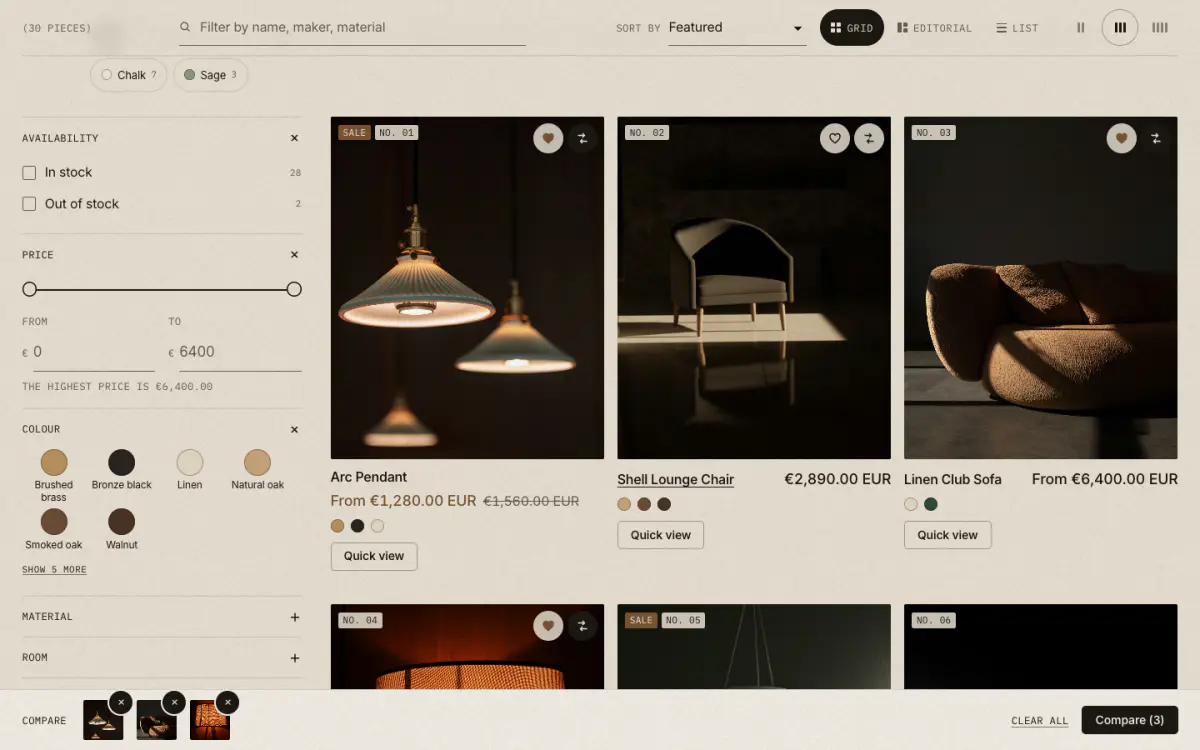
- 01Save heart
- 02Compare toggle
- 03Quick view
- 04Compare tray (2 to 4 pieces)
Turn them on
Most tools live in Theme settings › Product cards › Shopping tools, so they apply to every product card in the store at once.
- Quick button on cards
- Quick add (options and add to cart) or Quick view (photos, description, options and add to cart). Each section still has its own Show quick add switch
- Show a save heart
- On cards and on the product page. Pick a Saved pieces page to show a count in the header
- Show compare on cards
- Adds a compare toggle on cards and on the product page. Pick a Compare page
- Specification metafield namespace
- Which product metafields become rows on the Compare page. Default
specs, the same namespace the product page specification table reads
Quick view
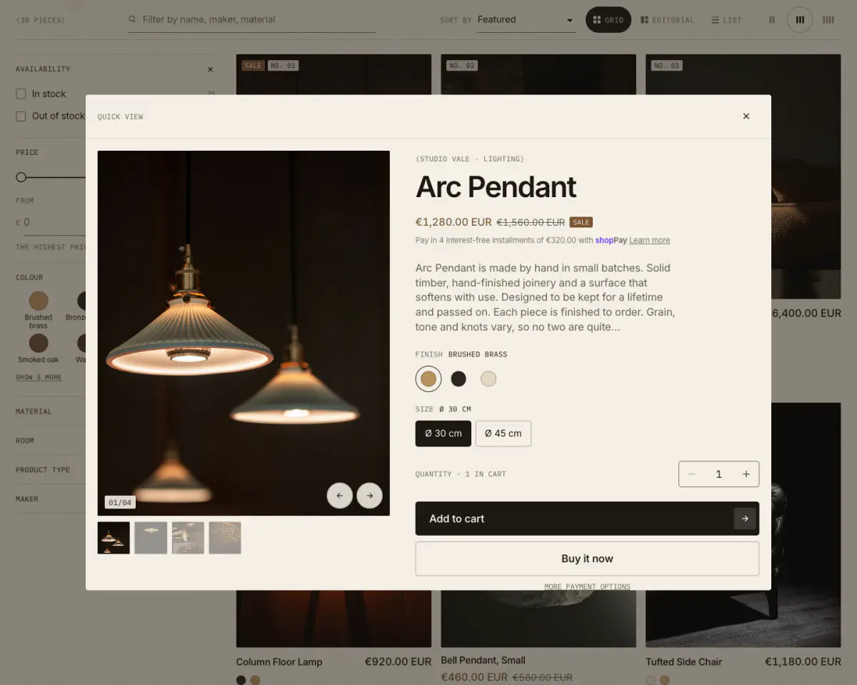
- 01Swipeable gallery with every photo
- 02Description excerpt
- 03Options and add to cart
- 04View full details
Quick view opens the product over the page: every photo in a swipeable gallery with thumbnails, the start of the description, the full option picker with prices and stock, add to cart and Buy it now, and a View full details link. Unlike quick add, it also opens on sold-out pieces, so shoppers can still read about them.
Quick view loads only when a shopper first uses it, so it adds nothing to the page’s first load.
Saved pieces
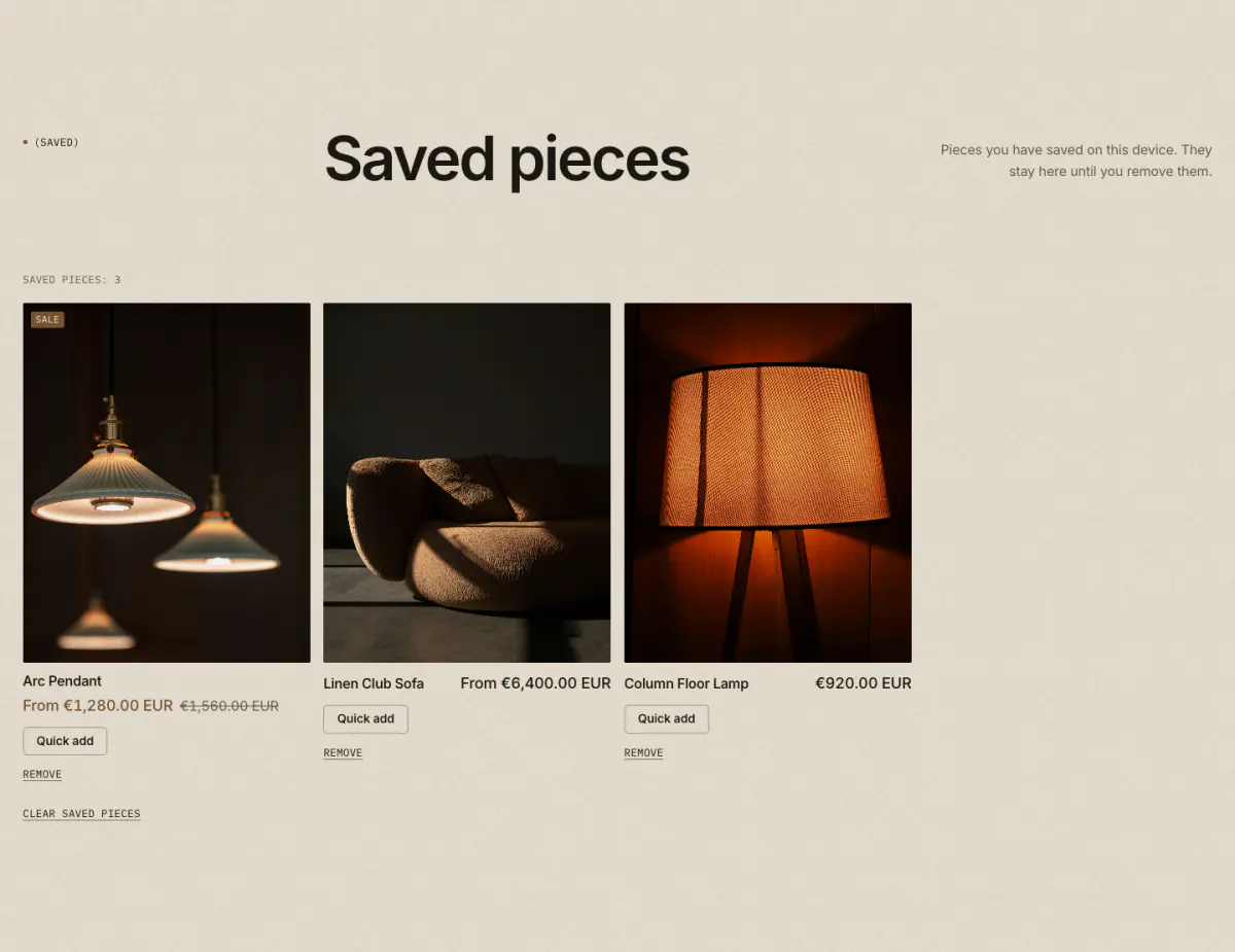
The heart saves a piece in the shopper’s browser: no account, no app and no data on your side. The header shows a link with the count once something is saved.
- Create the page. In Online Store › Pages, add a page called “Saved pieces” and choose the template
page.wishlist. - Pick it in Theme settings. Product cards › Shopping tools › Saved pieces page.
- Turn on the heart. Show a save heart on cards and product pages.
Because the list lives in the browser, it does not follow a shopper to another device. Each shopper sees only their own pieces.
Compare
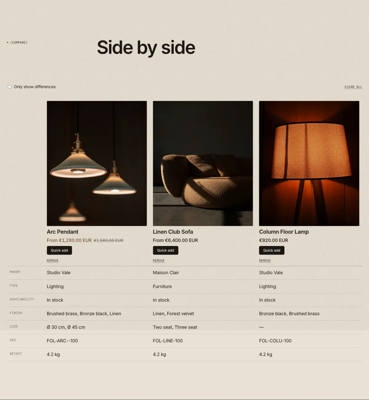
Shoppers tick Compare on up to four pieces. A slim tray at the bottom of the screen collects them; Compare opens the Compare page, which lines up photos, prices, availability and every specification in one table. Only show differences hides the rows where all pieces match.
- Create the page. Add a page called “Compare” with the template
page.compare. - Pick it in Theme settings. Product cards › Shopping tools › Compare page.
- Fill the specifications. Product metafields in the
specsnamespace (or the one you set) each become a row. They are the same metafields the product page specification table uses, so you fill them once.
Quick order list
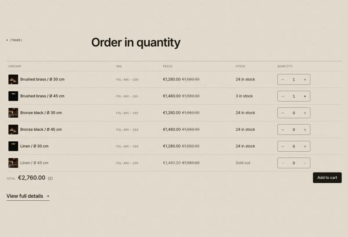
For trade and wholesale buyers: every variant of a product in a table, each with its own quantity. The list shows SKU, price (with quantity price breaks), stock and a live total, and adds all lines in one go. If a line can’t be added, only that row is marked and the rest still go in.
- As a product block
- Product page › Add block › Quick order list. Shows on products with variants unless you turn on Show for products without variants
- As a section
- Quick order list section on any page: pick a product. Good for a trade page
- B2B catalogs
- Quantity rules (minimum, maximum, increments) and quantity price breaks are applied automatically
- Long lists
- Rows before Show more pages long lists; a filter box finds a variant by option or SKU
Store pickup
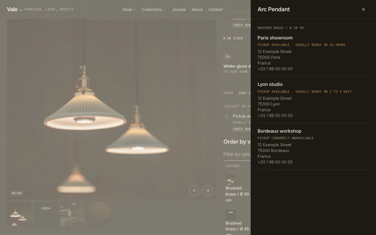
When Local pickup is on for a location (Settings › Shipping and delivery › Local pickup), the product page shows whether the selected variant can be collected today and how soon it’s usually ready. Check other stores opens a drawer with every pickup location, its address and status.
Pickup shows inside the Buy buttons block by default. For a more visible version, add the Pickup availability block where you want it, and turn pickup off in Buy buttons so it doesn’t show twice.
Combined listings
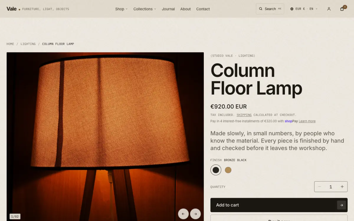
With Shopify’s Combined Listings app (Shopify Plus), separate products, for example one per finish, are grouped as if they were one. Vale reads that grouping: picking a swatch or option that belongs to a sibling product swaps that product in place, updating photos, price, title and the address. Card swatches link to the sibling directly. Without JavaScript, sibling options appear as plain links under Also available as.
There is nothing to turn on in the theme. Once a listing is combined in Shopify, the product page and cards follow it.
Infinite scroll
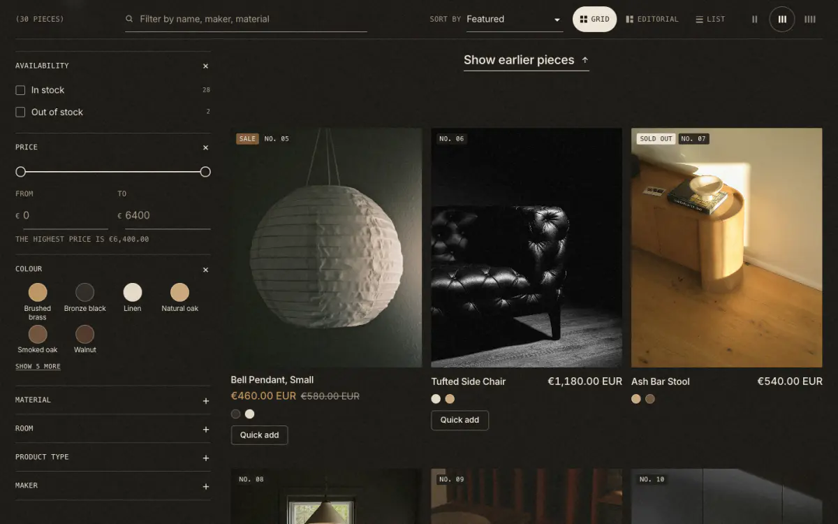
Collection and search pages can load the next page as shoppers reach the end of the grid. Choose Infinite scroll under Pagination in the Product grid section (and in the Search results section).
- Back button
- The address keeps
?page=up to date, so Back returns close to where the shopper was - Opened mid-way
- A page opened past page 1 shows Show earlier pieces at the top
- Fallback
- The Load more button stays as a fallback, and plain page links work without JavaScript
- Screen readers
- New pieces are announced, and focus is not moved
Age verifier
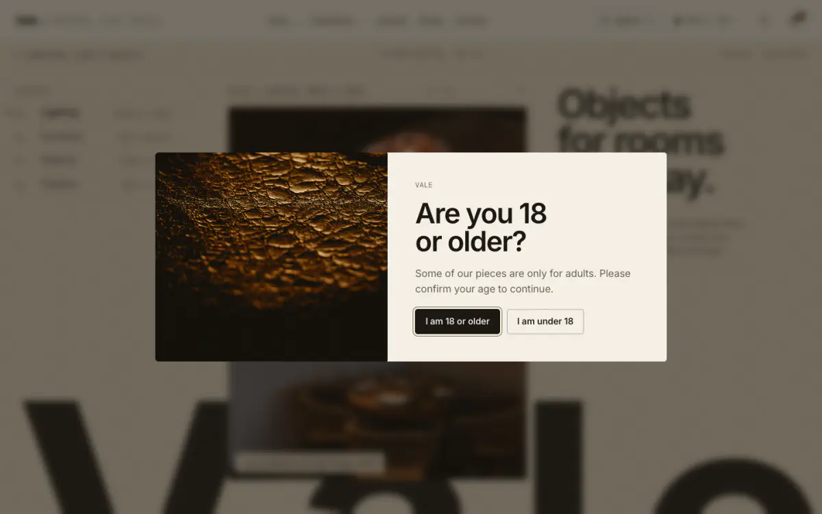
An entry screen that asks visitors to confirm their age before they browse, for stores selling wine, spirits or other age-restricted pieces. It sits in the footer group, hidden by default: open Footer in the editor’s sidebar and show Age verifier.
- Minimum age
- Shown in the buttons, for example “I am 18 or older”
- Decline
- Send declining visitors to a link, or show a message instead
- Remember the answer for
- Number of days before asking again; returning visitors never see it in between. 0 asks on every visit
- In the editor
- It only appears while the section is selected, so it never covers the page you are editing
An age check on a website is a courtesy, not legal verification. Check what your country requires for what you sell.
Shoppable video
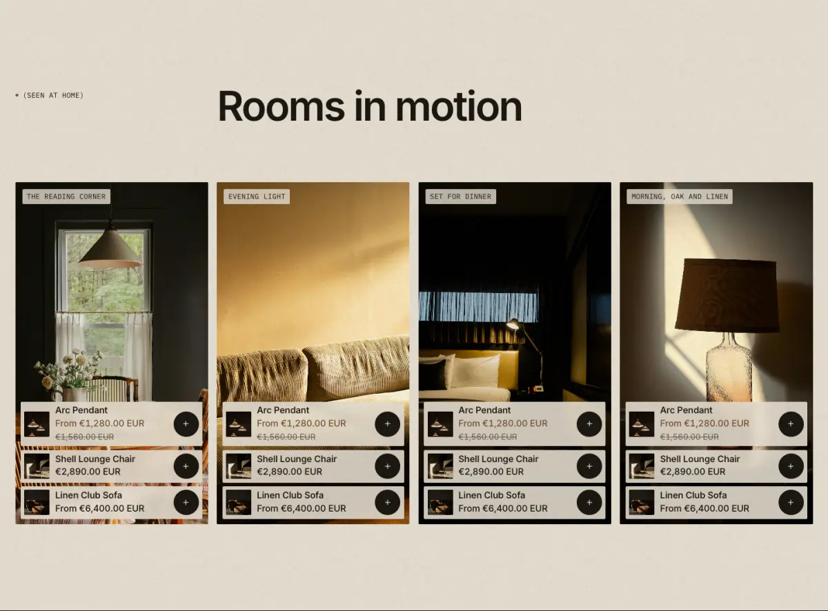
A row of short vertical clips, each tagged with up to three products. Tagged pieces open quick add or quick view (following the card setting). Clips play muted only while on screen, show their cover image for anyone who prefers reduced motion, and every clip has a pause control.
- Upload the clips. In Content › Files. A 9:16 clip of 10 to 30 seconds works best.
- Add the section. Add section › Shoppable video, then one Clip block per video.
- Tag the pieces. In each clip, choose up to three products and, optionally, a cover image and caption.