(Guides · Product page)
Product page
The product page pairs a gallery (stage with thumbnails, or stacked) with a sticky column of blocks. Long content can sit in a full-width details band below, in tabs, or inline.
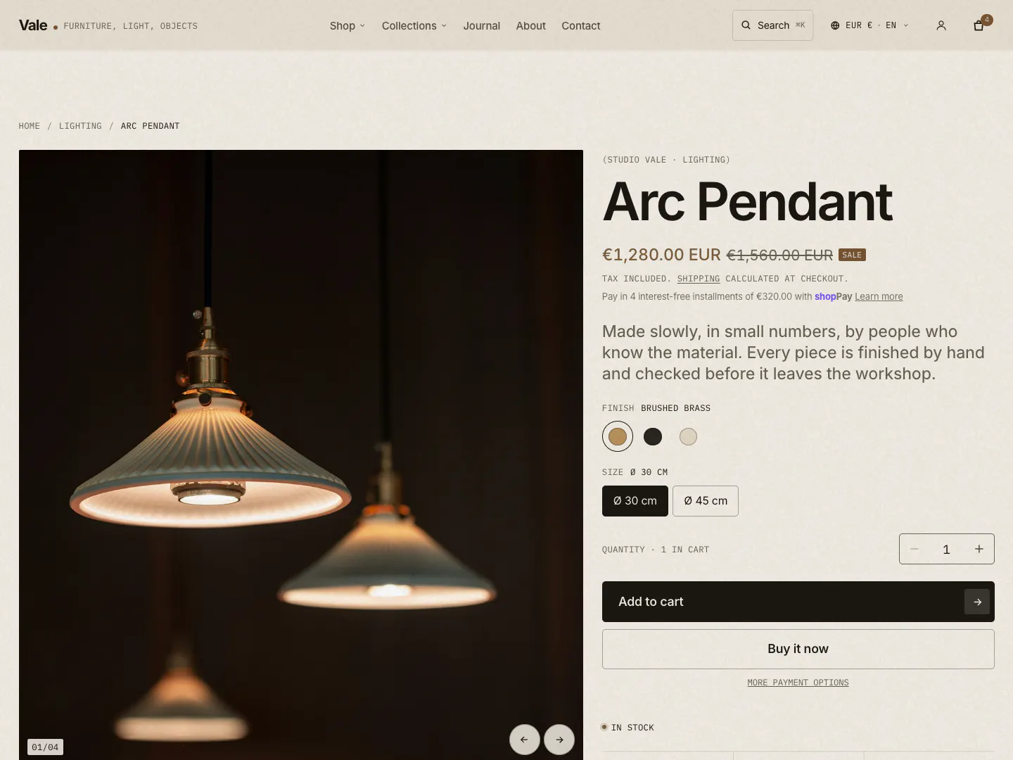
- 01Breadcrumbs
- 02Media gallery and zoom
- 03Title
- 04Price, sale price and installments
- 05Stock level
- 06Swatch option
- 07Button option
- 08Quantity
- 09Add to cart
- 10Dynamic checkout button
Section settings
- Gallery layout
- Stage with thumbnails · Stacked (desktop)
- Media
- Images, Shopify video, YouTube/Vimeo, and 3D models. Enable lightbox and zoom opens a full-screen viewer
- Long content placement
- Full-width details band below · Collapsed tabs in the info column · In the info column, as placed
- Sticky
- Keep media in view while scrolling; keep product info in view (desktop)
- Show sticky add to cart bar
- On by default. Once the main buttons scroll out of view, a slim bar slides up with the image, variant, price and add to cart button
- Show breadcrumb
- Home / collection / product
Blocks
- Title
- Show vendor and type label; title size
- Price
- Sale and unit prices, Shop Pay Installments banner, tax and shipping note
- Rating
- Stars from the
reviews.ratingmetafield - Variant picker
- Buttons or dropdowns; swatches from Shopify option values
- Quantity selector
- Quantity rules and volume pricing (B2B)
- Buy buttons
- Add to cart, subscriptions (selling plans), dynamic checkout, pickup availability, gift card recipient form
- Inventory status
- In stock / low stock, with an optional count
- SKU, Description, Text
- Description can sit in a collapsible row
- Collapsible row
- Your text, or a page's content
- Specifications table
- The signature spec label (see below)
- Document downloads
- Download tiles from a file metafield or links
- Popup
- A link that opens a page in a pop-up, such as the size guide
- Icon with text
- Up to three icons with a heading and text
- Complementary products
- Pairs well with…, with quick add
- Share, Custom Liquid, Apps
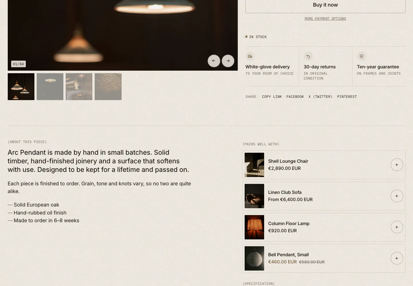
- 01Specification table (metafields)
- 02Icons with text
- 03Complementary products
- 04Share
Metafields Vale reads
Create these in Settings > Custom data > Products > Add definition. Use the exact namespace and key.
| Namespace and key | Type | Used by |
|---|---|---|
custom.material | List of single line text | Materials in the collection list (catalog) view. Change it in the Product grid's Materials metafield setting |
specs.<anything> | Single line text (one definition per row) | Spec table block, when its Metafield namespace is specs |
custom.downloads | List of files | Document downloads block (namespace and key are settings) |
reviews.rating | Rating | Rating block (stars and score) |
reviews.rating_count | Integer | Rating block (number of reviews) |
shopify.color-pattern | Category metafield | Swatches, when a variant option is connected to it |
Materials without metafields
If custom.material is empty, Vale reads product tags that start with the prefix material:, for example material:Oak and material:Brass. The prefix is a setting on the Product grid.
The spec table
- Create definitions in one namespace. For example
specs.dimensions,specs.weight,specs.finish,specs.lead_time,specs.origin. Each is single line text. - Fill them on each product. Empty fields are skipped, so a lamp and a sofa can show different rows.
- Point the block at the namespace. In the theme editor, open a product, select the Specifications table block and set Metafield namespace to
specs. Each field becomes a row; the key is the label, with underscores shown as spaces (lead_timereads "lead time").
The default product template's Spec table has two sample rows, Material: Solid oak, oiled and Lead time: 4–6 weeks. They appear on every product. Edit them, connect them to metafields with the dynamic source button, or clear them.
The block can also show the vendor, product type, SKU and weight, and up to six manual rows (label and value). Row values accept dynamic sources.
Document downloads
Create a custom.downloads definition of type List of files and upload spec sheets, care guides or CAD files to each product. Each file becomes a tile with its type (PDF, DWG…). The tile name is the file's alt text in Content > Files, or its file name. Without a metafield you can add up to three documents to the block by hand (name, link, format, details).
Rating
The Rating block shows nothing until reviews.rating has a value, so it is safe to leave in place. Review apps that follow Shopify's standard write these fields for you.
Swatches
Swatches come from Shopify itself. In the product admin, connect an option (such as Finish or Color) to a category metafield like Color and give each value a color or image. The Variant picker shows swatches when Show swatches is on; options without swatches show as buttons or a dropdown. Product cards show swatches when Show color swatches is on in the grid.
Size guide
- Create a page called Size guide (Online Store > Pages) with a table of dimensions.
- Point the Popup block at it. The default template already has a Popup block labelled "Size guide"; choose your page in its Page setting. It opens as an accessible pop-up and links to the page without JavaScript.
- Or use the Size guide section on a page, inline or behind a button, with rows as blocks (cells separated by a vertical bar) and a diagram.
Complementary products
The Complementary products block reads Shopify's complementary recommendations, which you set per product in the Search & Discovery app by Shopify. Related products below the page come from Shopify automatically.
Other product templates
Vale also includes product.minimal: title, price, variant picker, quantity, buy buttons, description and share, with related products in a carousel. And product.story: the full product form, followed by a materials story, an image-and-text chapter, delivery and care questions, related products and recently viewed. Assign either per product under Theme template.
Below the product, the default template shows related products and recently viewed products.