(Sections · Story)
Story and editorial
Sections for About pages, journals and the quieter parts of a home page. Most of them have no JavaScript at all; reveals are handled by the global "Reveal sections on scroll" setting.
- 01Story opening
- 02Editorial letter
- 03Founder quote
- 04Statement with image
- 05Timeline
- 06Chapters
- 07Materials story
- 08Before and after
- 09Closing statement
- 10Rich text
- 11Image with text
- 12Multirow
- 13Multicolumn
- 14Video
- 15Testimonials
- 16Quotes carousel
- 17Logo list
- 18Social grid
- 19Social handles
- 20Blog posts
Story opening
01 · story-opening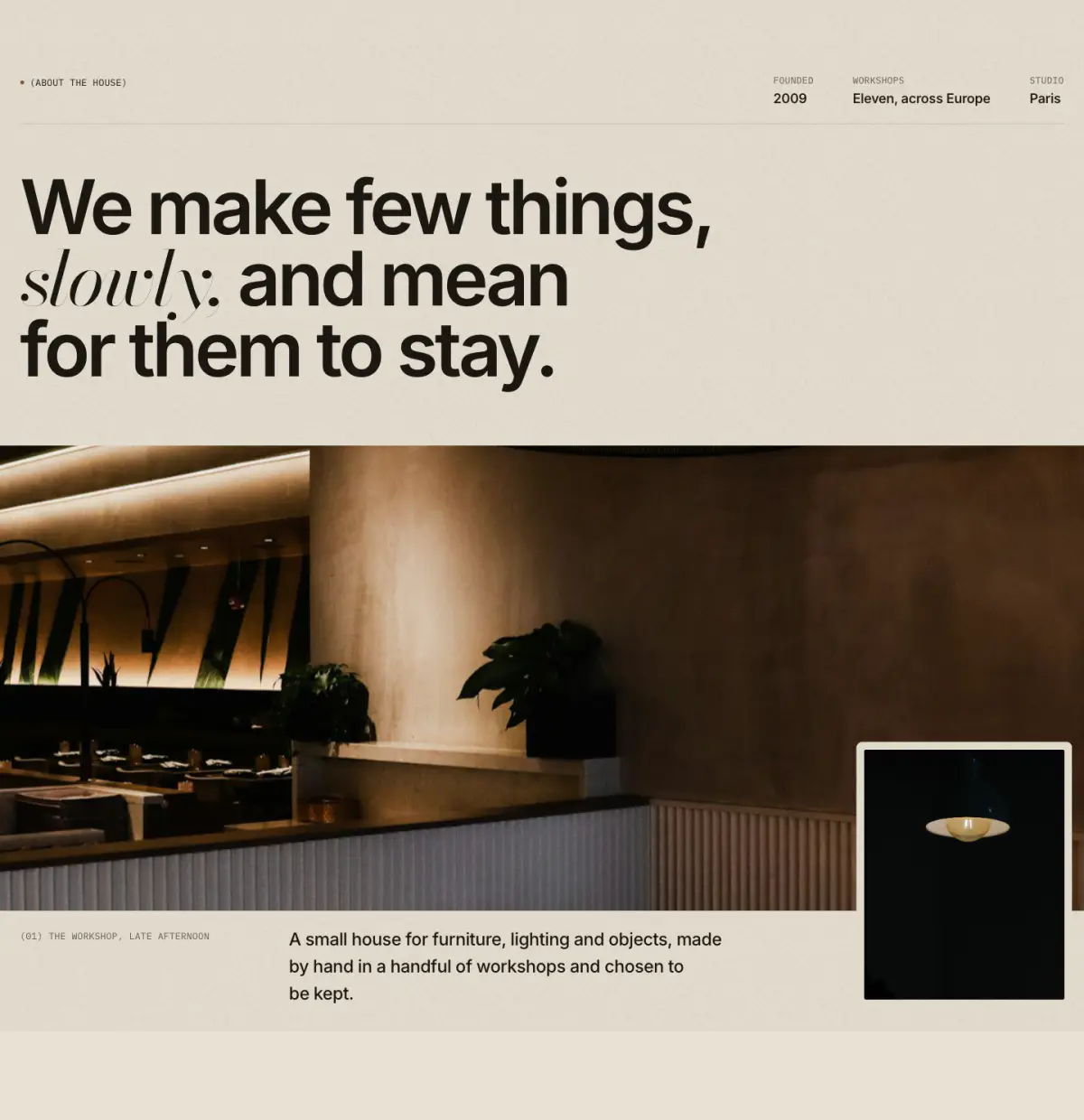
The first spread of an About page: a row of facts ("(Founded) 2009"), a large statement with italic words in the serif, then a wide photograph with an inset detail plate, a numbered caption and a short lead.
Tip: Turn on "Load the image first" when this is the first section of the page.
Key settings
- Eyebrow label
- Statement
- Heading levelH1 (page title) · H2
- Image
- Detail image
- Image shapeWide · Tall
- Full width
- Load the image first
- Caption
- Text
- Link label
- Link
Blocks (1)
- Fact
- Label, Value
Editorial letter
02 · editorial-letter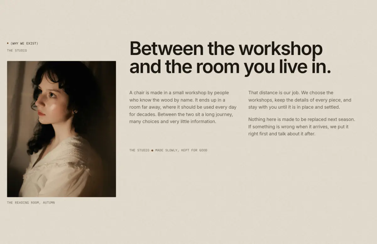
A narrow side column (eyebrow, place, photograph with caption) beside a large headline and a letter set in one or two columns, closed by a sign-off and an optional signature image.
Key settings
- Eyebrow label
- Show bronze dot
- Sub-label
- Heading
- Letter
- Text columnsOne · Two
- Image
- Caption
- Image positionLeft · Right
- Sign-off, first part
- Sign-off, second part
- Signature image
- First button label
- First button link
Founder quote
03 · founder-quote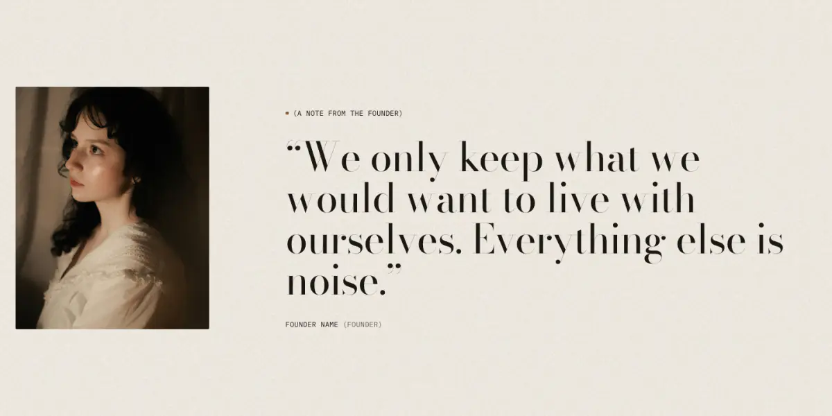
A portrait beside a large serif quote that rises line by line, closed by a signature image and a mono name and role.
Key settings
- Eyebrow label
- Show bronze dot
- Quote
- Name
- Role
- Portrait
- Signature image
- Portrait positionLeft · Right · No portrait
- Quote sizeMedium · Large
Statement with image
04 · statement-image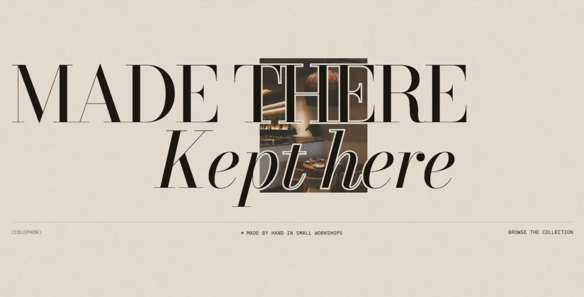
An enormous two-line Didone statement with a photograph behind or between the words. Two presets: "Statement with image" and "Statement over full image".
Tip: The image can drift slowly or settle from a zoom ("Image motion"); both follow "Animate on scroll".
Key settings
- Eyebrow label
- First line
- Second line
- Text sizeLarge · Extra large
- Second line indent
- Show image
- Image
- Image positionBetween the lines (offset) · Left · Right · Center
- Image sizeSmall · Medium · Large · Full bleed behind the words
- Focal pointMiddle center · Top center · Bottom center · Middle left · Middle right
- Veil over image
- Keyline around the words
- Caption
- Show meta row
- Left label
- Center label
- Right label
- Right label link
- Animate on scroll
- Image motionSlow drift · Settle from zoom · Still
- Intensity
Timeline
05 · timeline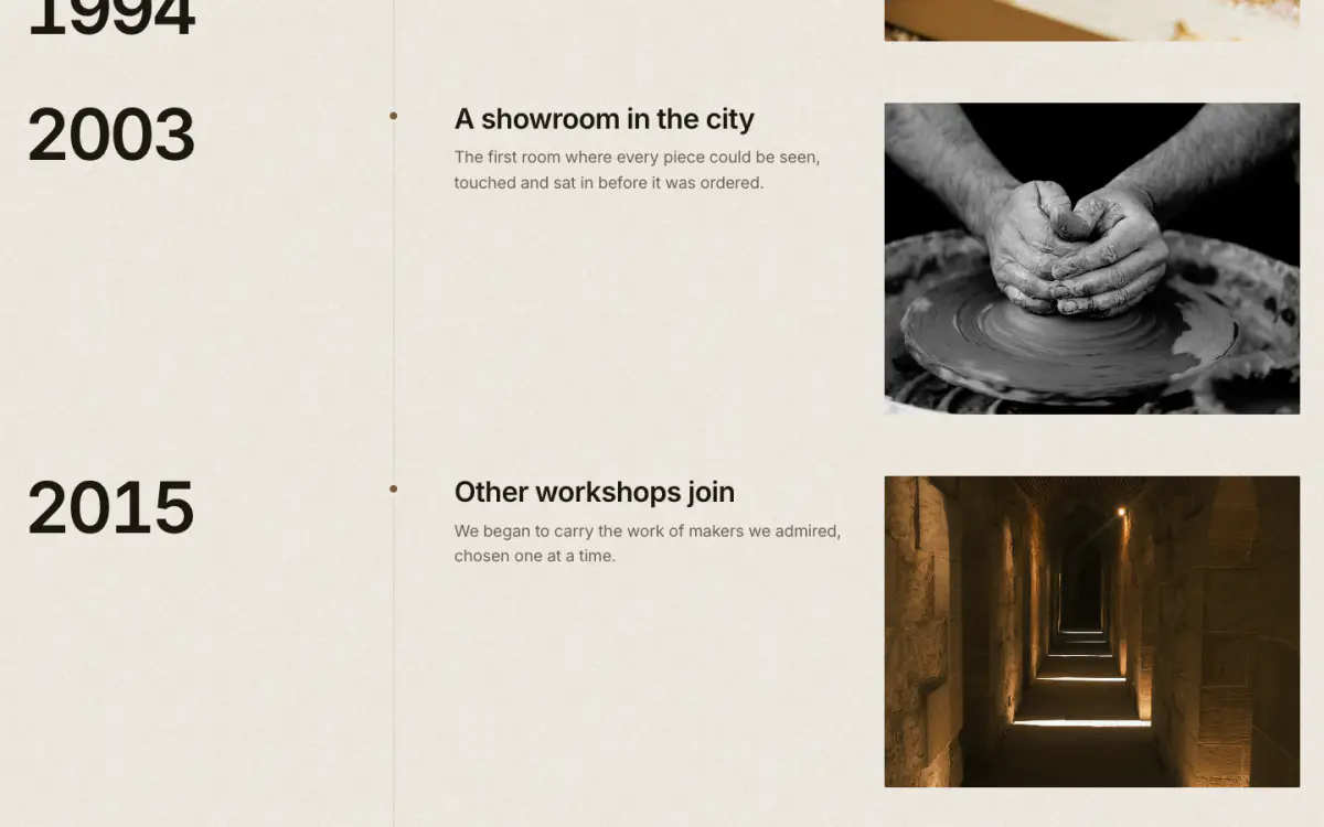
Brand story by year. Each event is a row on a vertical hairline with a bronze dot; the year stays beside its row while it scrolls.
Key settings
- Eyebrow label
- Show bronze dot
- Heading
- Note
- Year styleSerif · Sans-serif · Mono
- Image shapePortrait 4:5 · Portrait 3:4 · Tall 2:3 · Square · Landscape 4:3 · Landscape 3:2 · Wide 16:9
Blocks (1)
- Event
- Year, Heading, Text, Image, Caption
Chapters
06 · chapters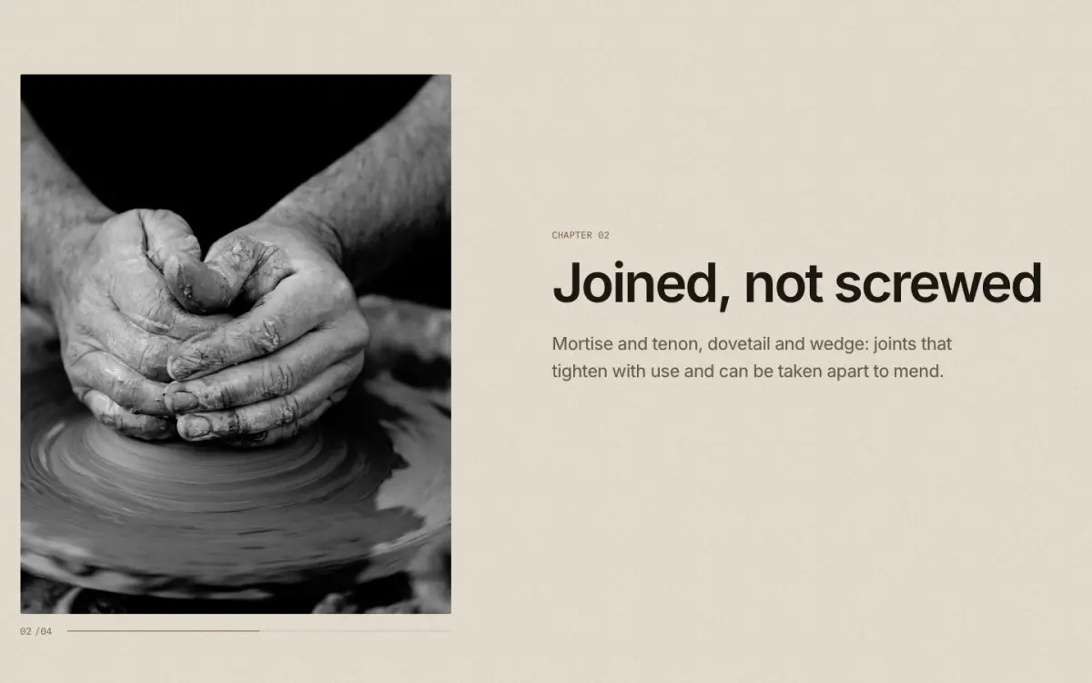
Scrollytelling: one sticky plate beside text steps. As each step reaches the middle of the screen the plate cross-fades to its image and a counter turns ("02/04"). On phones, without JavaScript or with reduced motion, each step shows its own image.
Key settings
- Eyebrow label
- Show bronze dot
- Heading
- Image positionLeft · Right
- Image shapePortrait 4:5 · Portrait 3:4 · Tall 2:3 · Square · Landscape 4:3 · Landscape 3:2 · Wide 16:9
- Dim the steps that are not in view
Blocks (1)
- Step
- Eyebrow label, Heading, Text, Image, Link label, Link
Materials story
07 · materials-story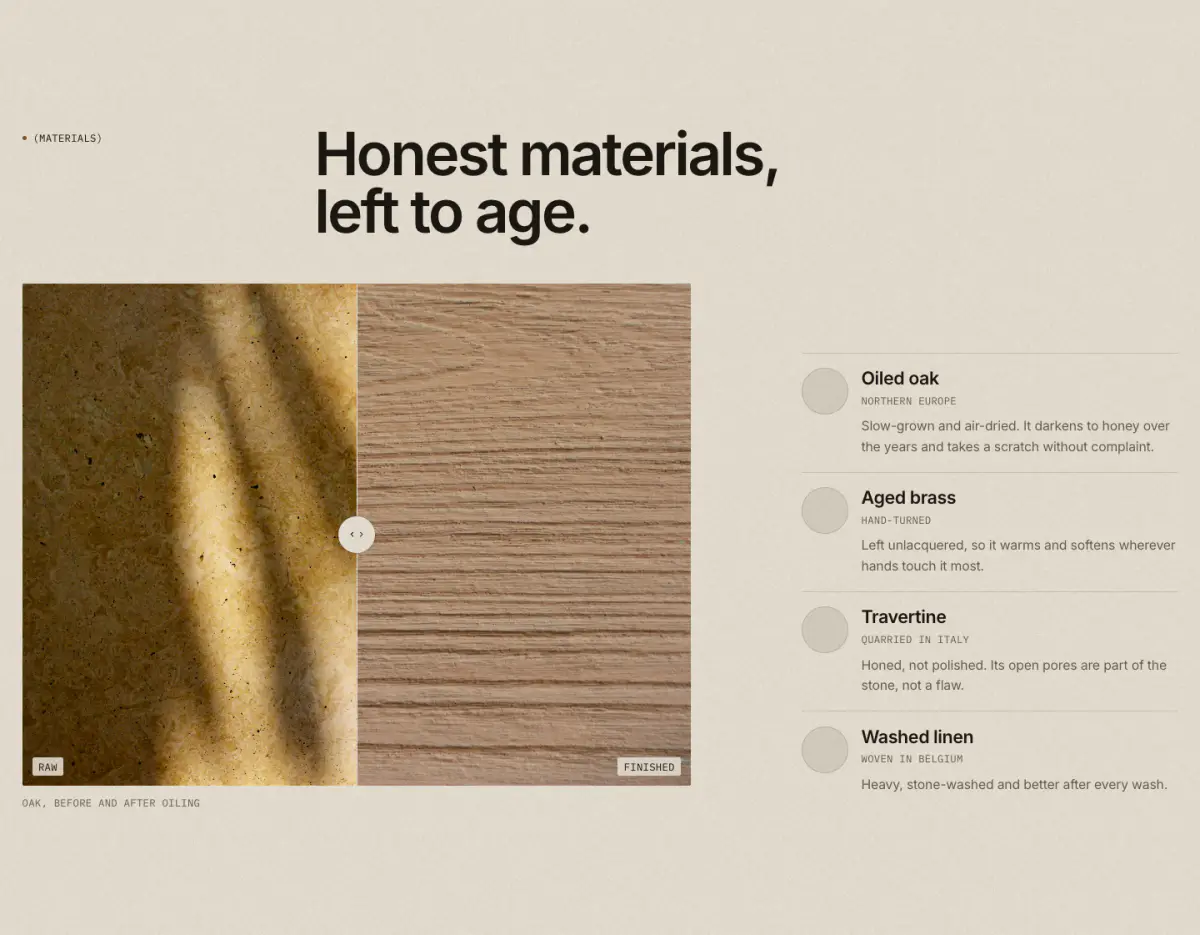
A before/after comparison slider plus material swatches (image or color, name, origin, text). The slider is a native range input, so it works with the keyboard.
Key settings
- Eyebrow label
- Show bronze dot
- Heading
- Note
- Show the comparison slider
- Before image
- Before label
- After image
- After label
- Starting position
- Image shapePortrait 4:5 · Portrait 3:4 · Tall 2:3 · Square · Landscape 4:3 · Landscape 3:2 · Wide 16:9
- Caption
Blocks (1)
- Material
- Swatch image, Swatch color, Name, Origin, Text
Before and after
08 · before-after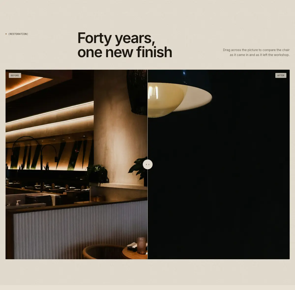
Two photographs of the same view, compared with a divider: drag anywhere across the picture, or Tab to it and use the arrow, Home, End and Page keys. Screen readers hear the position as a percentage. Without JavaScript the picture shows half and half. Good for restorations, finishes and room makeovers.
Tip: Use two images of the same size and framing. Materials story also has a comparison slider, alongside material swatches.
Key settings
- Eyebrow label
- Heading
- Heading sizeLarge · Medium · Small · Serif display
- Text
- Before image
- Before label
- After image
- After label
- Caption
- Divider starts at
- Image shapeWide 16:9 · Landscape 3:2 · Landscape 4:3 · Square · Portrait 4:5
- WidthPage width · Full width
Closing statement
09 · closing-cta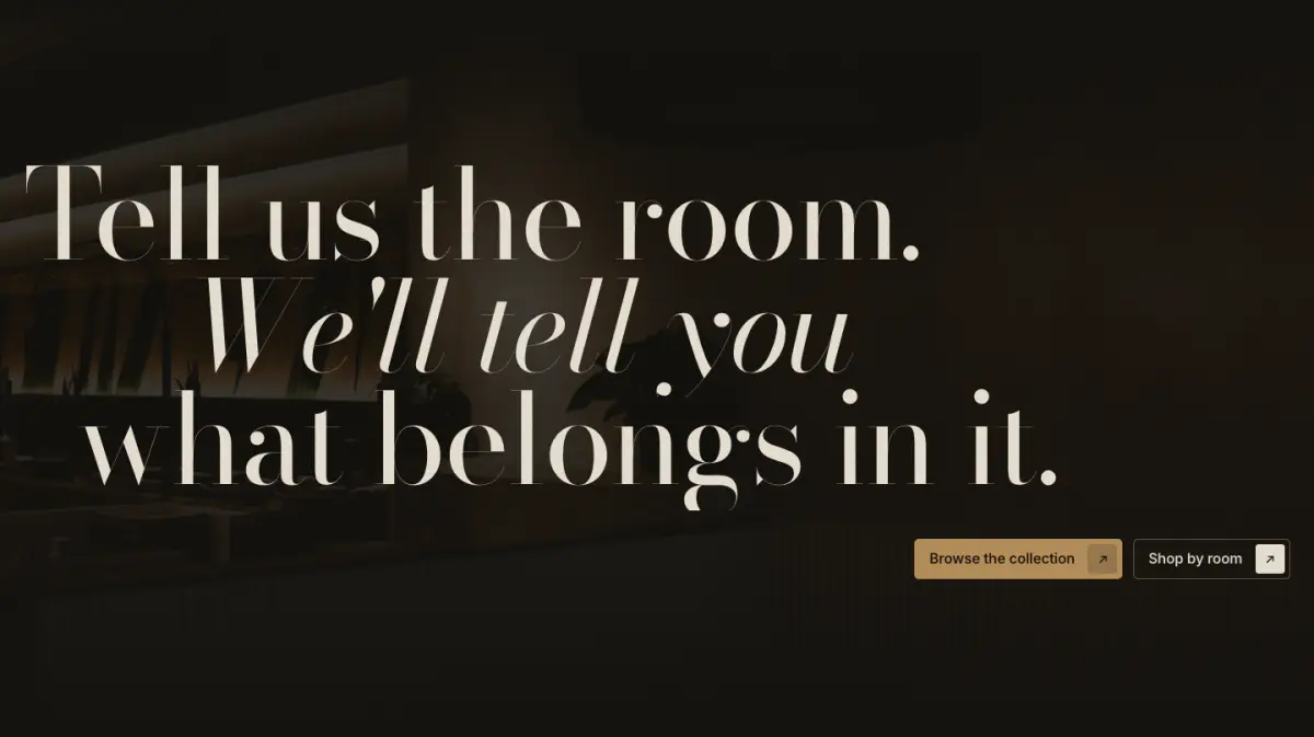
A huge serif closing statement, one line per block (roman or italic, with an indent), over an optional darkened photograph, with up to two buttons.
Key settings
- Eyebrow label
- Show bronze dot
- Supporting text
- Statement sizeMedium · Large
- Button alignmentLeft · Right
- First button label
- First button link
- Second button label
- Second button link
- Image
- Image strength
Blocks (1)
- Line
- Line, Italic, Indent
Rich text
10 · rich-text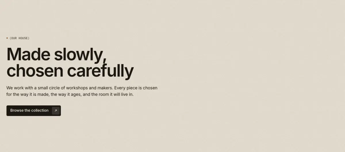
Eyebrow, heading, text and buttons in a measured column.
Key settings
- AlignmentLeft · Center
- Column widthNarrow · Wide
Blocks (4)
- Eyebrow
- Eyebrow label, Show bronze dot
- Heading
- Heading, Heading size
- Text
- Text, Larger text
- Buttons
- First button label, First button link, Button style, Second button label, Second button link
Image with text
11 · image-with-text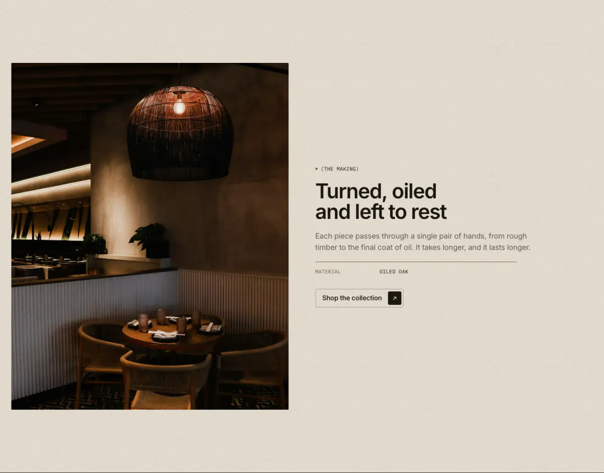
An image beside a column of blocks: eyebrow, heading, text, spec rows (grouped into the signature spec label), buttons and custom Liquid.
Key settings
- Image
- Caption
- Image positionImage first · Image second
- Image widthNarrow · Half · Wide
- Image shapePortrait 4:5 · Portrait 3:4 · Tall 2:3 · Square · Landscape 4:3 · Landscape 3:2 · Natural
- Text vertical positionTop · Middle · Bottom
- AlignmentLeft · Center
Blocks (6)
- Eyebrow
- Eyebrow label, Show bronze dot
- Heading
- Heading, Heading size
- Text
- Text, Larger text
- Spec row
- Label, Value
- Buttons
- First button label, First button link, Button style, Second button label, Second button link
- Custom Liquid
- Custom Liquid
Multirow
12 · multirow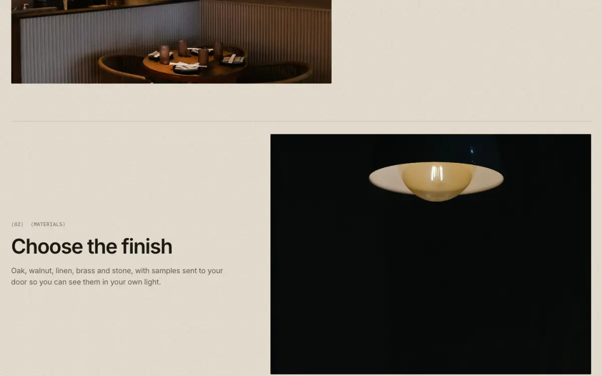
Alternating image and text rows, each opened by a hairline and an optional "(01)" number.
Key settings
- Eyebrow label
- Heading
- Heading sizeLarge · Medium · Small · Serif display
- Image shapePortrait 4:5 · Portrait 3:4 · Square · Landscape 4:3 · Landscape 3:2 · Wide 16:9
- Image widthHalf · Wide
- Image positionImage first · Image second
- Alternate image sides
- Show numbers (01)
- Show hairline above each row
Blocks (1)
- Row
- Image, Eyebrow label, Heading, Text, Button label, Link, Button style
Multicolumn
13 · multicolumn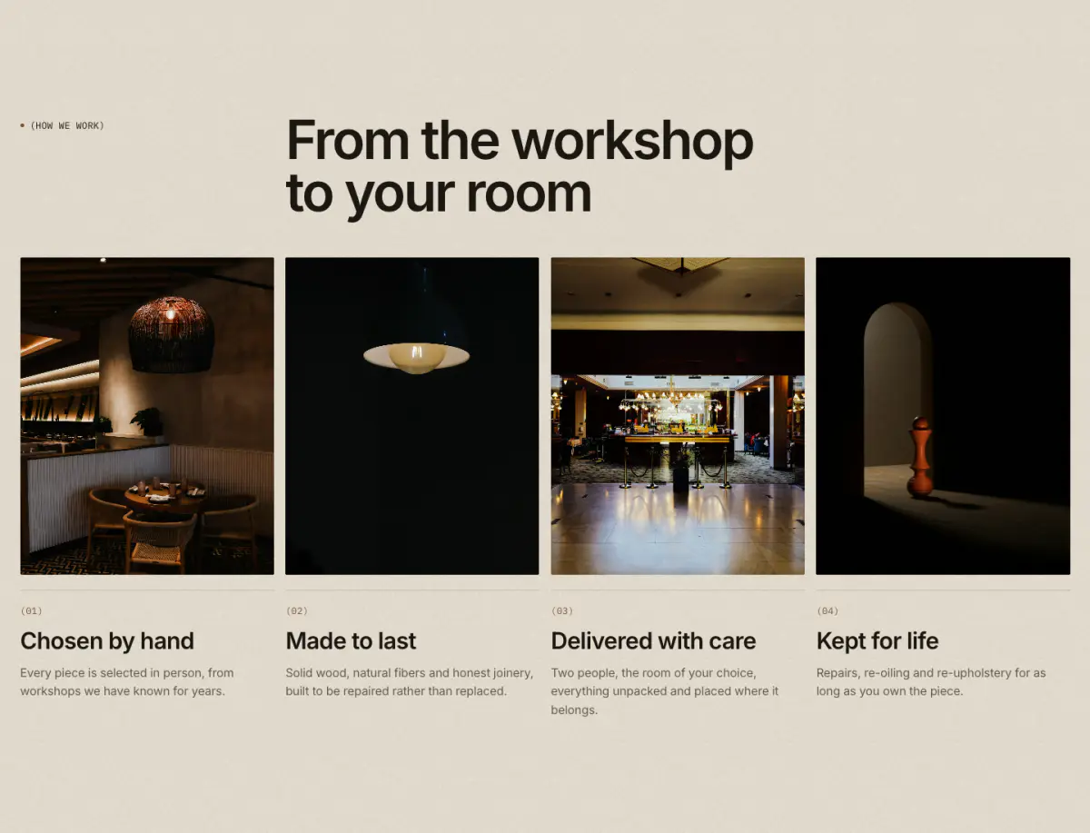
Columns of image or icon, heading, text and link. On phones: one or two columns, or a swipe carousel.
Key settings
- Eyebrow label
- Heading
- Heading sizeLarge · Medium · Small · Serif display
- Text
- Link label
- Link
- Heading layoutEditorial (three columns) · Left · Center
- Columns on desktop
- Mobile layout1 column · 2 columns · Swipe carousel
- Image shapePortrait 4:5 · Portrait 3:4 · Square · Landscape 4:3 · Landscape 3:2 · Wide 16:9
- AlignmentLeft · Center
- Show numbers (01)
- Show hairline above text
- Button label
Blocks (1)
- Column
- Image, Icon (when there is no image), Heading, Text, Link label, Link
Video
14 · video
A Shopify-hosted video or a YouTube/Vimeo link behind a cover image. Nothing loads from YouTube or Vimeo until the visitor presses play. A hosted silent loop pauses when off screen.
Tip: Always set a cover image and a video description for screen readers.
Key settings
- Eyebrow label
- Heading
- Heading sizeLarge · Medium · Small · Serif display
- Text
- Shopify-hosted video
- YouTube or Vimeo URL
- Cover image
- Video description
- Video behaviorLoop silently (muted, autoplay) · Play button (with sound)
- Caption
- Image shapeWide 16:9 · Panorama 21:9 · Landscape 4:3 · Square · Portrait 4:5
- Full width
Testimonials
15 · testimonials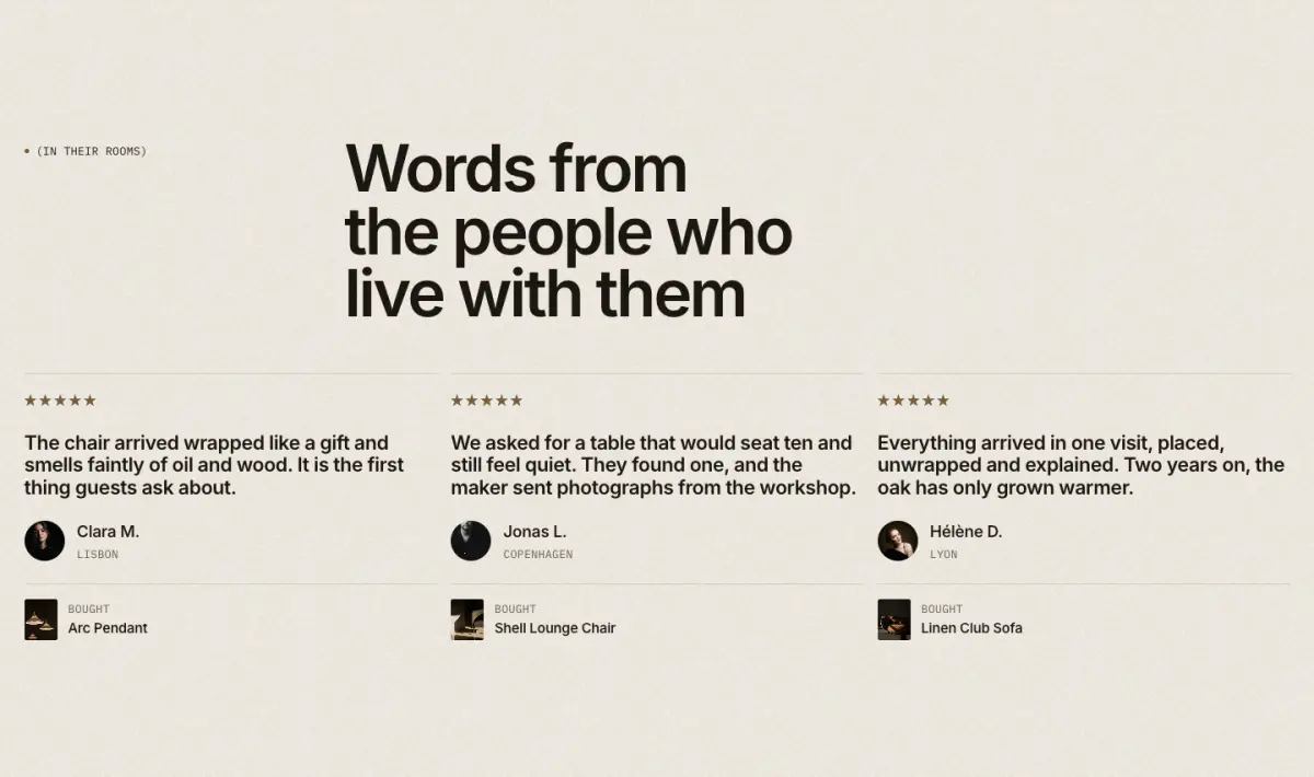
Eight layouts in one section: grid, carousel, spotlight, quote over image, wall of quotes, press (logos and scores), ticker of short quotes, and quotes with products. Every quote is marked up as a quotation with its source.
Key settings
- Eyebrow label
- Heading
- Heading sizeLarge · Medium · Small · Serif display
- Text
- LayoutGrid · Carousel · Spotlight: one large quote with portrait · Quote over image · Wall of quotes · Press, with logos and scores · Ticker of short quotes · With products
- Columns on desktop
- Card styleHairline · Panel
- Quote sizeLarge · Medium · Serif display
- Wall portraitsArched · Round · Hidden
- Accent card color scheme
- Show quick add
- Image
- Image overlay
- Auto-rotate
- Change every
- Ticker pace per quote
Blocks (1)
- Testimonial
- Quote, Name or publication, Role or place, Portrait, Rating, Score, Publication logo, Product
Quotes carousel
16 · quotes-carousel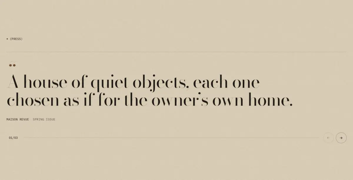
Press or customer quotes, one at a time in a large serif, with a counter, arrows and a progress hairline.
Key settings
- Eyebrow label
- Heading
- Heading sizeLarge · Medium · Small · Serif display
- AlignmentLeft · Center
- Auto-rotate
- Change every
Blocks (1)
- Quote
- Quote, Source, Detail, Source logo, Link
Logo list
17 · logo-list
Press or maker logos in a hairline grid or a slow marquee. A logo without an image shows its name in mono type.
Key settings
- Eyebrow label
- Heading
- Heading sizeLarge · Medium · Small · Serif display
- Heading layoutEditorial (three columns) · Left · Center
- LayoutGrid · Slow marquee
- Columns on desktop
- Logo height
- Marquee duration
- Muted monochrome logos
Blocks (1)
- Logo
- Image, Name, Link
Social handles
19 · follow-strip
Social handles set large in the serif, in a hairline row or a slow marquee. Handles come from blocks or from Theme settings > Social media.
Key settings
- Eyebrow label
- Heading
- Heading sizeLarge · Medium · Small · Serif display
- HandlesFrom blocks · From theme social links
- LayoutHairline row · Slow marquee
- Handle size
- Marquee duration
Blocks (1)
- Handle
- Network, Handle, Link
Blog posts
20 · blog-posts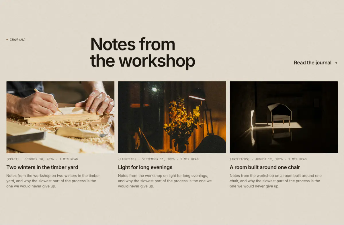
The latest articles from one blog, as a grid or as a lead article with a grid beside it, with image, date, author and excerpt as you choose.
Key settings
- Blog
- Posts to show
- Show image
- Show date
- Show author
- Show excerpt
- Eyebrow label
- Heading
- Heading sizeLarge · Medium · Small · Serif display
- Text
- Link label
- Link
- LayoutGrid · Lead article + grid
- Columns on desktop
- Image shapePortrait 4:5 · Square · Landscape 4:3 · Landscape 3:2 · Wide 16:9
Social grid
18 · social-gridAn Instagram-style grid built from your own images and videos, with no app. Each post can link anywhere.
Key settings
Blocks (2)