(Sections · Info)
Information and service
Practical sections: shipping promises, numbers, specifications, locations, contact and questions.
- 01Announcement bar
- 02Countdown timer
- 03Icon bar
- 04Trust strip
- 05Key figures
- 06Services list
- 07Specifications
- 08Size guide
- 09Showroom with map
- 10Store locations
- 11Contact form
- 12Contact details and form
- 13Collapsible content
- 14Newsletter
- 15Email signup banner
- 16Newsletter popup
- 17Page
- 18Custom Liquid
- 19Age verifier
Announcement bar
01 · announcement-bar
A thin mono line above the header (it lives in the header group). One message is static; several rotate, pausing on hover and focus, with a pause button. Optional social icons and local time on desktop. A Countdown message adds a running timer after its text and, when time is up, shows another message or removes itself.
Key settings
- Rotate messages
- Change every
- Show social icons on desktop
- Show local time on desktop
- Time zone
Blocks (2)
- Announcement
- Text, Link
- Countdown
- Text, Ends at, Link, Show seconds, When time is up, Message when time is up
Countdown timer
02 · promo-countdown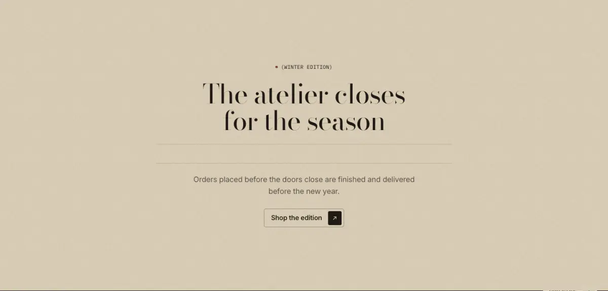
A quiet countdown to the end of an offer, a launch or an event: eyebrow, heading, the clock in large numerals, text and a button, on a color scheme or over an image. When time is up it shows a message or hides itself; this is decided on the server too, so a cached page never shows 00:00:00. The clock only ticks while it is on screen. Presets: Countdown timer and Countdown timer with image.
Tip: Write Ends at with its time zone offset, for example 2026-12-24T18:00:00+01:00 for 6 pm in Paris in winter. Without an offset the visitor's own time zone is used. For a one-line countdown, use the Countdown block in the announcement bar instead.
Key settings
- Eyebrow label
- Heading
- Text
- Ends at
- Show days
- Show seconds
- When time is upShow a message · Hide the section
- Message when time is up
- Button label
- Link
- Button styleSolid · Outline · Accent
- BackgroundColor scheme · Image
- Image
- AlignmentCenter · Left
- HeightSmall · Medium · Large
- Image overlay
Icon bar
03 · icon-bar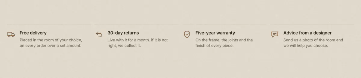
Shipping, returns, warranty: line pictograms (24 built in, or your own image) with a heading and a short line.
Key settings
- Eyebrow label
- Show bronze dot
- StyleRow with hairlines · Centered columns
- Icon sizeSmall · Medium · Large
Blocks (1)
- Item
- Icon, Custom icon, Heading, Text, Link
Trust strip
04 · trust-strip
A quiet mono band of guarantees between hairlines, as a row or a slow marquee, optionally with payment icons.
Key settings
- StyleRow · Scrolling marquee
- Marquee duration
- Show icons
- Show payment icons
- Show hairlines above and below
Blocks (1)
- Item
- Icon, Text, Link
Key figures
05 · stats-counters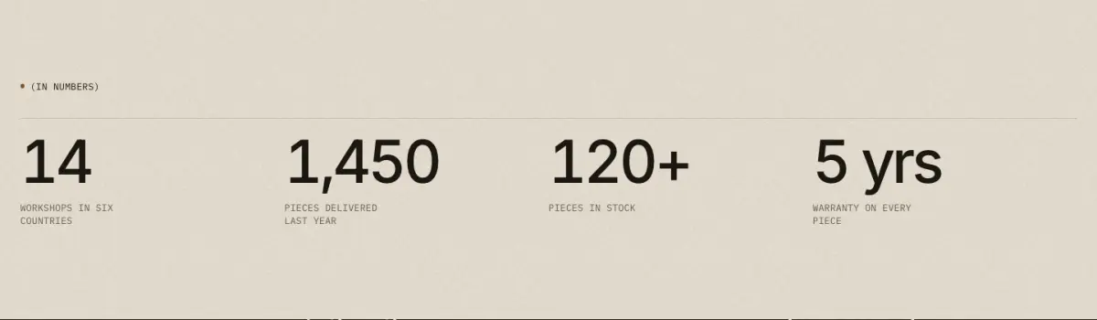
Proof numbers: big tabular figures over a hairline with a mono label. "Count up when seen" counts from zero; prefixes and suffixes such as "120+" are kept.
Key settings
- Eyebrow label
- Show bronze dot
- Heading
- Columns on desktop
- Count up when seen
- Number sizeMedium · Large
Blocks (1)
- Stat
- Value, Label, Detail, Link
Services list
06 · services-list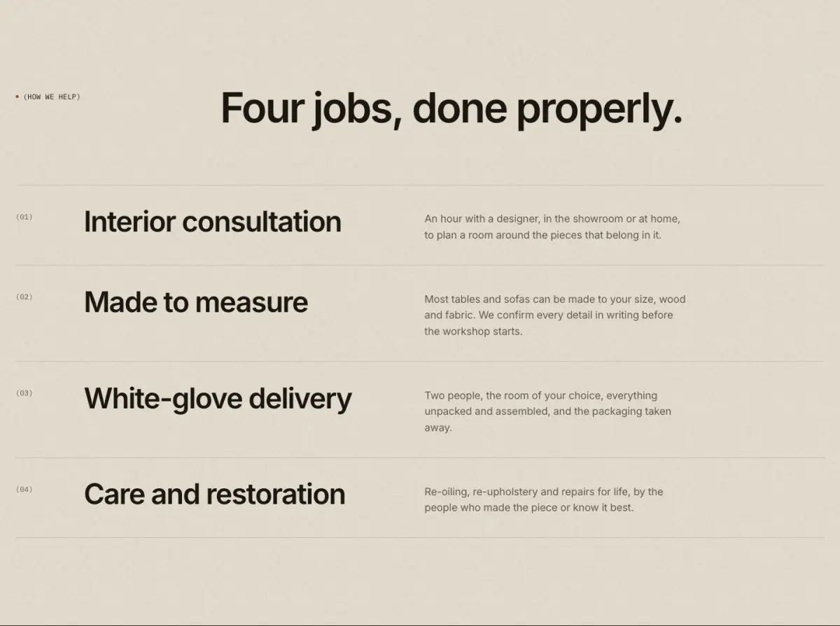
Numbered rows with a large title, description and a small image on hover, or steps in columns.
Key settings
- Eyebrow label
- Show bronze dot
- Heading
- Note
- StyleNumbered rows · Steps in columns
- Columns for steps
- Show the image when a row is hovered
Blocks (1)
- Service
- Heading, Text, Image, Link
Specifications
07 · spec-table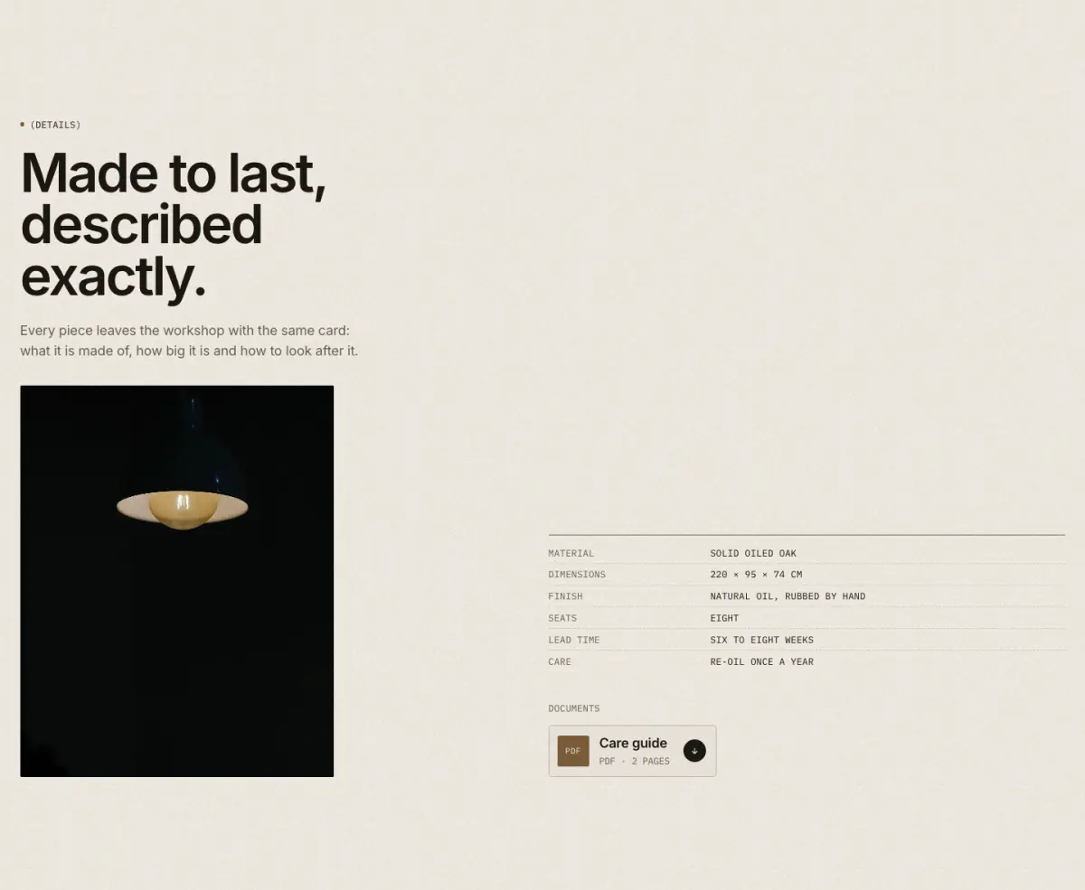
The spec label as a section: an intro column beside the signature table (a bronze rule, mono rows). Document blocks become download tiles. On product templates, row values accept dynamic sources (metafields).
Key settings
- Eyebrow label
- Show bronze dot
- Heading
- Text
- Image
- Table sizeRegular · Large
- Keep each row on one line
Blocks (2)
- Row
- Label, Value
- Document
- Name, Details, Icon text, File link
Size guide
08 · size-guide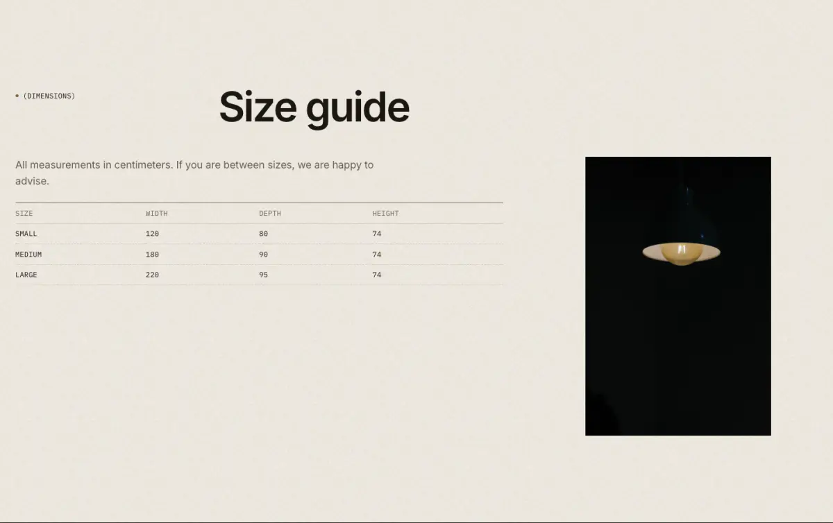
A dimensions table (rows are blocks; separate cells with a vertical bar), a diagram and notes, shown on the page or behind a button that opens a pop-up.
Tip: For product pages, the usual route is the Popup block pointing to a page. See Product page.
Key settings
- Eyebrow label
- Show bronze dot
- Heading
- Text
- Column headings
- Diagram
- Notes
- DisplayOn the page · Button that opens a pop-up
- Button label
Blocks (1)
- Row
- Cells
Showroom with map
09 · showroom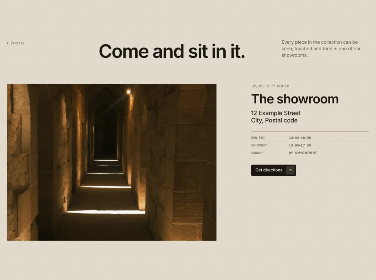
Store locations: a map image or photograph beside the details (address, opening hours, telephone, email, a live local clock) and a directions button. Without a link, directions open the address in Google Maps.
Tip: Good for the "store locator" use case without an app.
Key settings
- Eyebrow label
- Show bronze dot
- Heading
- Note
- Map image shapePortrait 4:5 · Portrait 3:4 · Tall 2:3 · Square · Landscape 4:3 · Landscape 3:2 · Wide 16:9
- Map positionLeft · Right
- Directions label
Blocks (1)
- Location
- Sub-label, Name, Address, Opening hours, Telephone, Email, Time zone for the local clock, Map or photo, Directions link, Second button label, Second button link
Store locations
10 · store-locations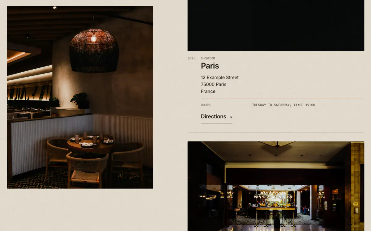
Showrooms, stockists or studios as a numbered list: name, address, opening hours, telephone, email and a note in the spec-label table, each with a Directions link. An optional static map image (your own illustration or a screenshot) sits beside the list and stays in view on desktop. No map service or API key is used.
Tip: Leave Directions link empty and it opens a Google Maps search for the address. For a single showroom with a local clock, use Showroom with map; the page.showroom template uses both.
Key settings
- Eyebrow label
- Heading
- Heading sizeLarge · Medium · Small · Serif display
- Text
- Show map image
- Map image
- Caption
- Image positionLeft · Right
- Image shapePortrait 4:5 · Square · Landscape 4:3
Blocks (1)
- Location
- Label, Name, Address, Opening hours, Telephone, Email, Note, Directions link, Image
Contact form
11 · contact-form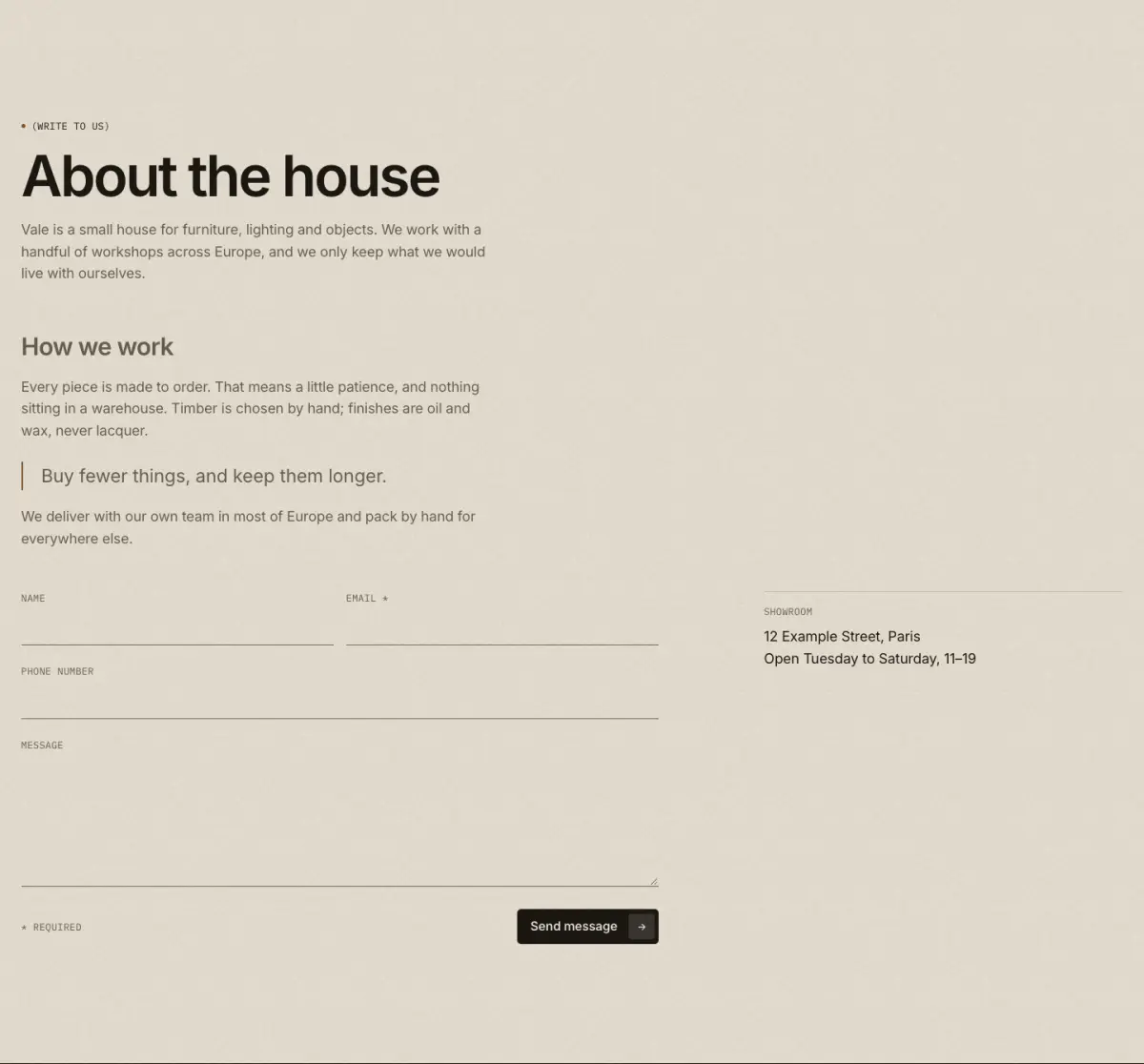
Shopify's contact form (name, email, optional phone, message) with an error summary, a success message and an optional column of details. On a page template it can show the page title and content above the form.
Key settings
- Use the page title and content
- Eyebrow label
- Heading
- Heading sizeLarge · Medium · Small · Serif display
- Text
- Show phone field
- Button label
Blocks (1)
- Detail
- Heading, Text
Contact details and form
12 · contact-split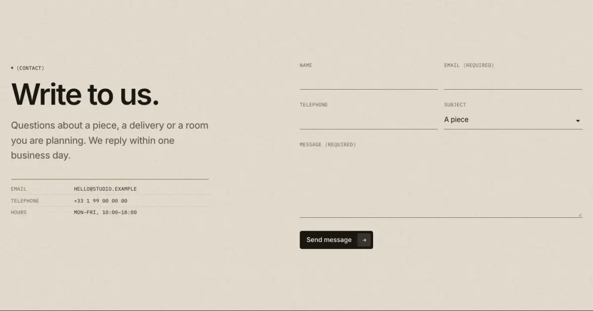
Contact details beside the contact form, with optional telephone and subject fields and social links.
Key settings
- Eyebrow label
- Show bronze dot
- Heading
- Text
- Show social links
- Ask for a telephone number
- Subjects
- Button label
Blocks (2)
- Contact detail
- Label, Value, Link
- Custom Liquid
- Custom Liquid
Collapsible content
13 · collapsible-content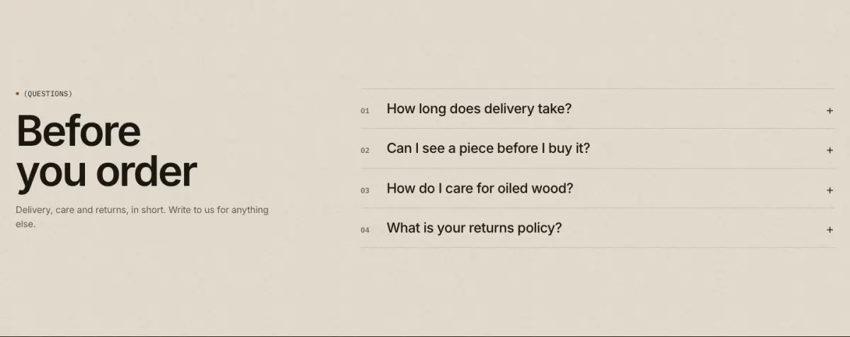
Questions and details in native disclosure rows that work without JavaScript. Optional numbers, an open first row and FAQ structured data for search engines.
Tip: Use "Add FAQ structured data" on one FAQ section per page only.
Key settings
- Eyebrow label
- Heading
- Heading sizeLarge · Medium · Small · Serif display
- Text
- Link label
- Link
- LayoutHeading left, questions right · Heading above · Centered
- Show numbers (01)
- Open the first row
- Invert rows on hover
- Add FAQ structured data
Blocks (1)
- Row
- Heading, Answer, Answer from a page
Newsletter
14 · newsletter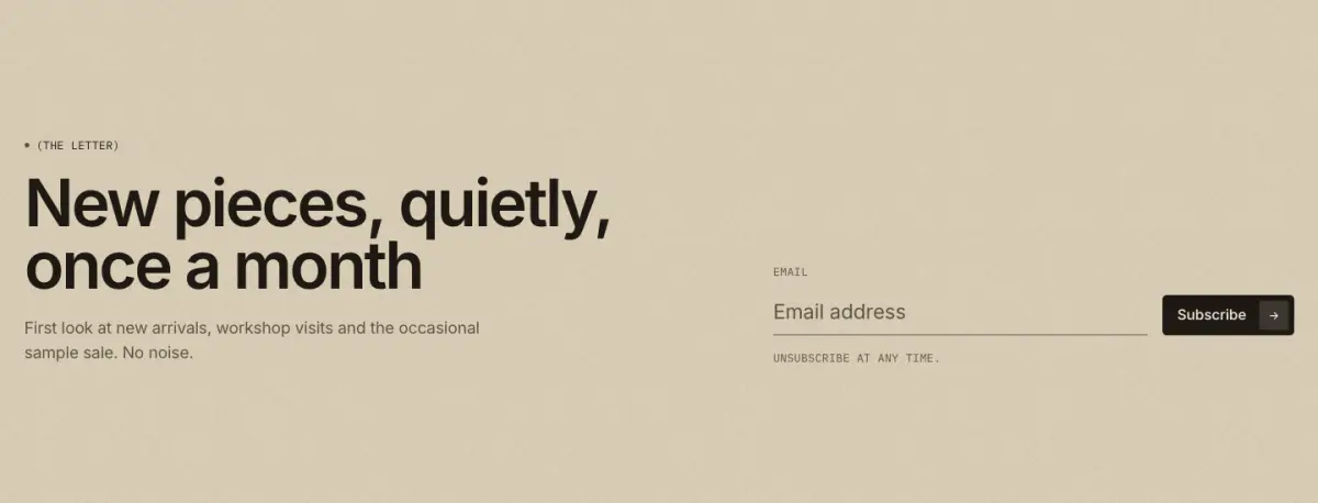
Email signup with Shopify's customer form (tagged newsletter): mono label, hairline input and arrow button.
Key settings
- Eyebrow label
- Heading
- Heading sizeLarge · Medium · Small · Serif display
- Text
- Button label
- Small print
- Show social links
- LayoutText left, form right · Centered
Email signup banner
15 · email-signup-banner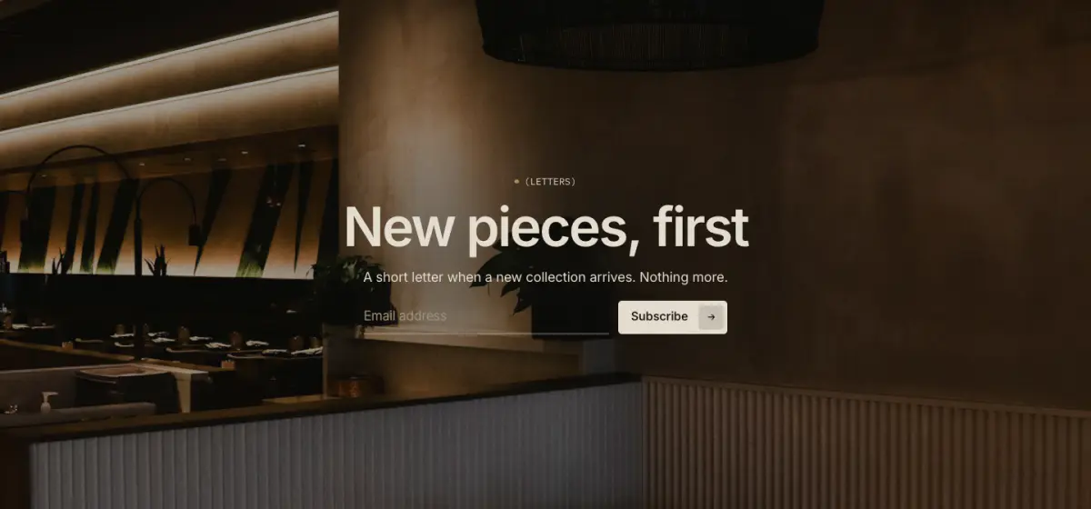
A background image with a newsletter signup placed in one of nine positions.
Key settings
- Background image
- Image overlay
- HeightAdapt to first image · Small · Medium · Large · Full screen
- Content positionTop left · Top center · Top right · Middle left · Middle center · Middle right · Bottom left · Bottom center · Bottom right
- Full width
- Show content panel
- Stack text below image on mobile
Blocks (4)
- Eyebrow
- Eyebrow label, Show bronze dot
- Heading
- Heading, Heading size
- Text
- Text
- Email form
- Button style, Note below the form
Newsletter popup
16 · newsletter-popup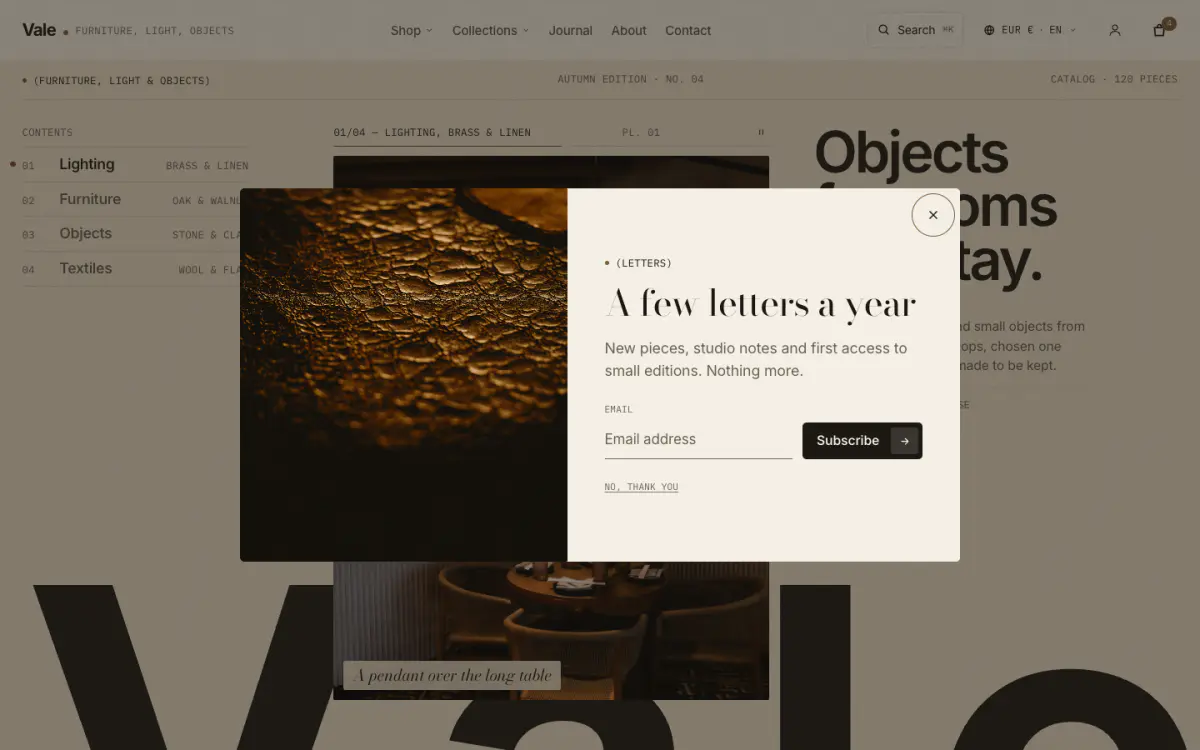
A signup dialog that opens after a delay or when the visitor moves to leave, with an optional image beside the form and an optional discount code shown after signup. Each visitor sees it once, then again after the number of days you set; anyone who signs up never sees it again. Sign-ups land in Customers with email marketing consent. It ships hidden in the footer group: open Footer in the sidebar and show Newsletter popup to turn it on.
Tip: In the theme editor it has no timers: select the section to open it, deselect it to close it. Create the discount code in Discounts first. Nothing about the popup loads until the browser is idle, so it doesn't slow the first paint.
Key settings
- Eyebrow label
- Heading
- Text
- Button label
- Small print
- Heading after signup
- Discount code
- ImageImage on the left · Image on the right · No image
- Image
- Open after
- Show again after
- Also open on page exit (desktop)
- Show on desktop
- Show on mobile
Page
17 · page
Shows a chosen page's title and content anywhere.
Key settings
- Page
- Eyebrow label
- Show page title
- Heading sizeLarge · Medium · Small · Serif display
- Column widthNarrow · Wide
- AlignmentLeft · Center
Custom Liquid
18 · custom-liquid
Your own Liquid or HTML inside a color scheme and the page width.
Key settings
- Liquid code
- Full width
Age verifier
19 · age-verifier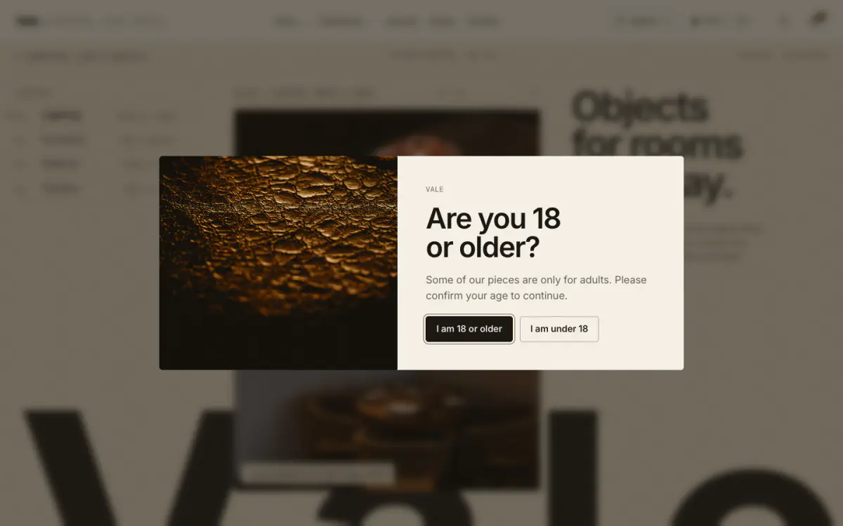
Asks visitors to confirm their age before they browse. A true dialog that Escape can’t close; declining sends visitors to a link or shows a message, and the answer is remembered for the number of days you set. It ships hidden in the footer group: open Footer in the sidebar and show Age verifier.
Tip: In the theme editor it only appears while the section is selected. See Shopping tools.
Key settings
- Minimum age
- Heading
- Text
- Image
- Show logo
- Confirm button label
- Decline button label
- Decline link
- Decline message
- Small print
- Remember the answer for
- Color scheme