(Sections · Heroes)
Heroes
The first thing a visitor sees. Every hero has a heading level setting: keep H1 on the first hero of a page and H2 anywhere else, so each page has exactly one H1. Images marked as the first hero load first; the rest load lazily. Every hero, the image banner and the slideshow can also play a silent Shopify-hosted video loop: the image stays as the poster and fallback, the video plays only while on screen and never with reduced motion, and Play video on phones can keep phones on the still image.
- 01Hero: editorial cover
- 02Hero: photo with index
- 03Hero: split plates
- 04Hero: statement
- 05Hero: filmstrip gallery
- 06Image banner
- 07Slideshow
Hero: editorial cover
01 · hero-cover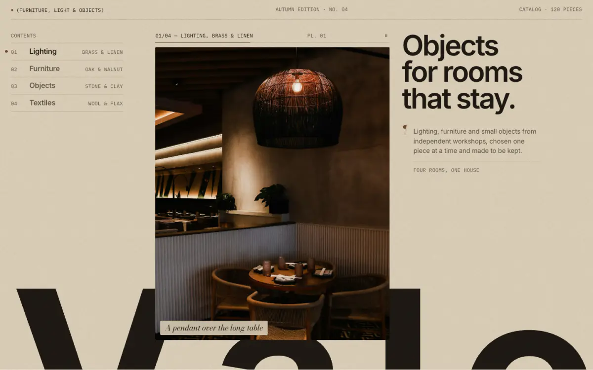
The editorial magazine cover and the Vale preset's home page opener. A giant cropped wordmark, a contents column (one entry per plate), a tall plate that cross-fades through the plate images with numbered captions, and a marginal note. There are no buttons by default; add them in the button settings if you want them.
Tip: Plates: 1200 x 1600px recommended. Hovering or focusing a contents entry jumps to its plate. "Turn plates automatically" pauses on hover and stops with reduced motion.
Key settings
- Fill the screen
- Show giant wordmark
- Wordmark text
- Eyebrow label
- Show bronze dot
- Masthead middle
- Masthead right
- Heading
- Heading levelH1 (page title) · H2
- Marginal note
- Note footer
- Contents label
- Plate shapePortrait 4:5 · Classic 3:4 · Tall 2:3
- Show caption on the image
- Turn plates automatically
- Change plates every
- First button label
- First button link
- Second button label
- Second button link
Blocks (1)
- Plate
- Heading, Sub-label, Image, Caption, Link, Note footer for this plate
Hero: photo with index
02 · hero-index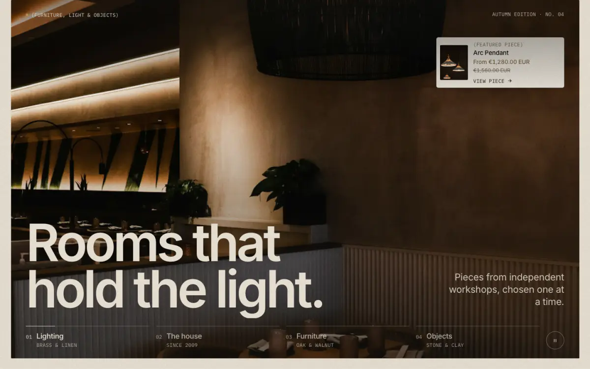
A full-bleed photograph (or video) per chapter with a large headline and a numbered chapter index. Chapters cross-fade slowly, and a chapter can instead be a statement (text, no picture) or carry a small product card. The Still preset opens with it.
Tip: Turn off "Slow drift on the photograph" for a completely still hero. The pause control and reduced motion stop the drift and the rotation.
Key settings
- Text over the photograph
- Shade behind text
- Eyebrow label
- Show bronze dot
- Masthead right
- Heading
- Heading levelH1 (page title) · H2
- Heading fontGrotesk · Didone serif
- Subheading
- First button label
- First button link
- Second button label
- Second button link
- Fill the screen
- Frame the photograph on the ground
- Index label
- Slow drift on the photograph
- Change slides automatically
- Change slides every
Blocks (1)
- Chapter
- Chapter style, Image, Video, Heading, Sub-label, Link, Statement, Attribution, Statement color scheme, Show a product card, Product, Card position, Card color scheme
Hero: split plates
03 · hero-split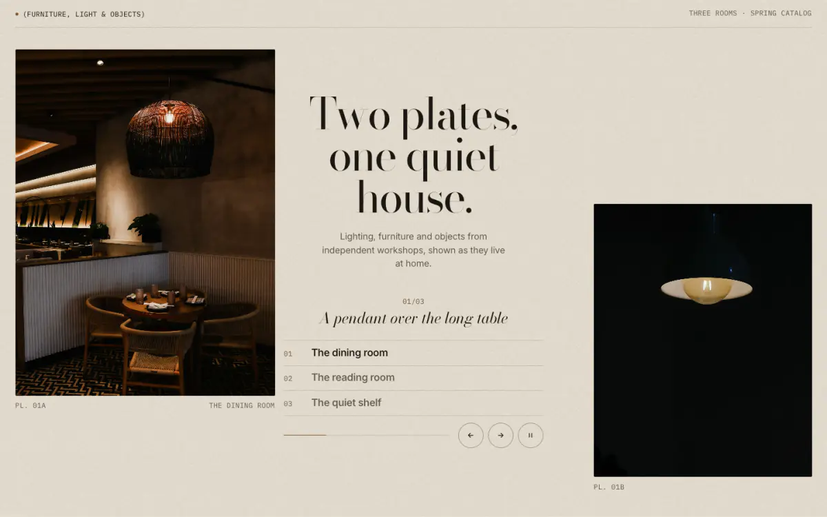
Two tall plates with the headline between them. Each slide holds a left and a right photograph; they cross-fade a beat apart.
Key settings
- Eyebrow label
- Show bronze dot
- Masthead right
- Heading
- Heading levelH1 (page title) · H2
- Heading fontGrotesk · Didone serif
- Text
- First button label
- First button link
- Second button label
- Second button link
- Fill the screen
- Change slides automatically
- Change slides every
Blocks (1)
- Slide
- Left image, Right image, Heading, Caption, Link
Hero: statement
04 · hero-statement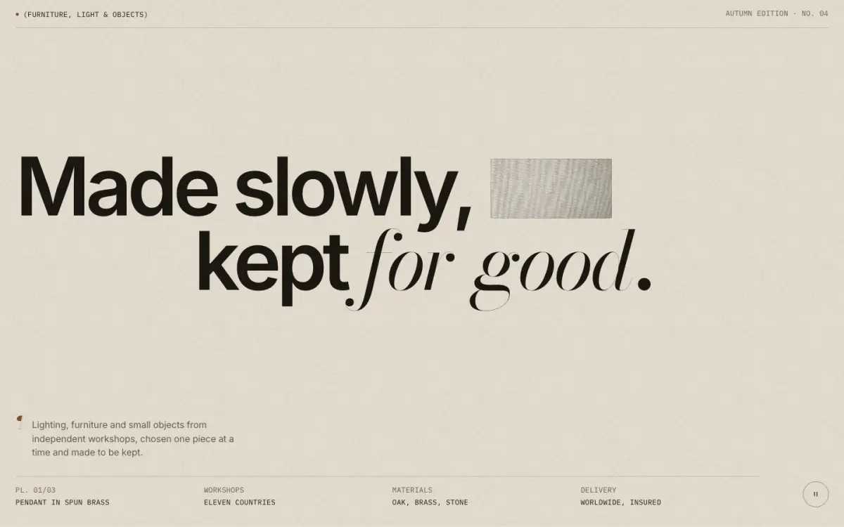
Text first: an enormous two-line statement with a small inset photograph set inside the line. Italic words (the I button) are set in the Didone serif.
Tip: Up to three detail pairs (label and value) sit under the statement, like a colophon.
Key settings
- Eyebrow label
- Show bronze dot
- Masthead right
- First line
- Second line
- Heading levelH1 (page title) · H2
- Heading fontGrotesk · Didone serif
- Marginal note
- Detail N label
- Detail N value
- First button label
- First button link
- Second button label
- Second button link
- Fill the screen
- Inset image positionEnd of the first line · Start of the second line
- Inset shapeRectangle · Pill · Arch
- Change slides automatically
- Change slides every
Blocks (1)
- Inset image
- Image, Caption
Hero: filmstrip gallery
05 · hero-gallery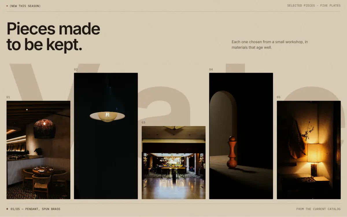
An editorial filmstrip: three to five plates of different heights standing on one baseline in front of a giant wordmark, like prints on a ledge.
Key settings
- Eyebrow label
- Show bronze dot
- Masthead right
- Heading
- Heading levelH1 (page title) · H2
- Heading fontGrotesk · Didone serif
- Text
- Caption note
- First button label
- First button link
- Second button label
- Second button link
- Show giant wordmark
- Wordmark text
- Wordmark toneSoft, tinted with the accent · Text color
- Fill the screen
Blocks (1)
- Plate
- Image, Heading, Sub-label, Height, Link
Image banner
06 · image-banner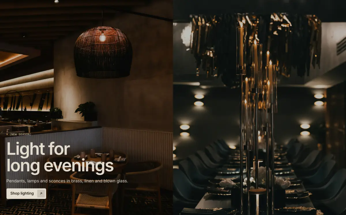
One or two full-bleed images with text placed in one of nine positions. Supports a separate mobile image, an overlay, a content panel and stacking the text under the image on phones.
Tip: Set "Heading level" to H1 only when the banner is the first section on the page.
Key settings
- First image
- Second image
- Mobile image
- Image overlay
- Heading levelH1 (page title) · H2
- HeightAdapt to first image · Small · Medium · Large · Full screen
- Content positionTop left · Top center · Top right · Middle left · Middle center · Middle right · Bottom left · Bottom center · Bottom right
- Full width
- Show content panel
- Stack text below image on mobile
- Slow zoom as it appears
Blocks (4)
- Eyebrow
- Eyebrow label, Show bronze dot
- Heading
- Heading, Heading size
- Text
- Text
- Buttons
- First button label, First button link, Button style, Second button label, Second button link
Slideshow
07 · slideshow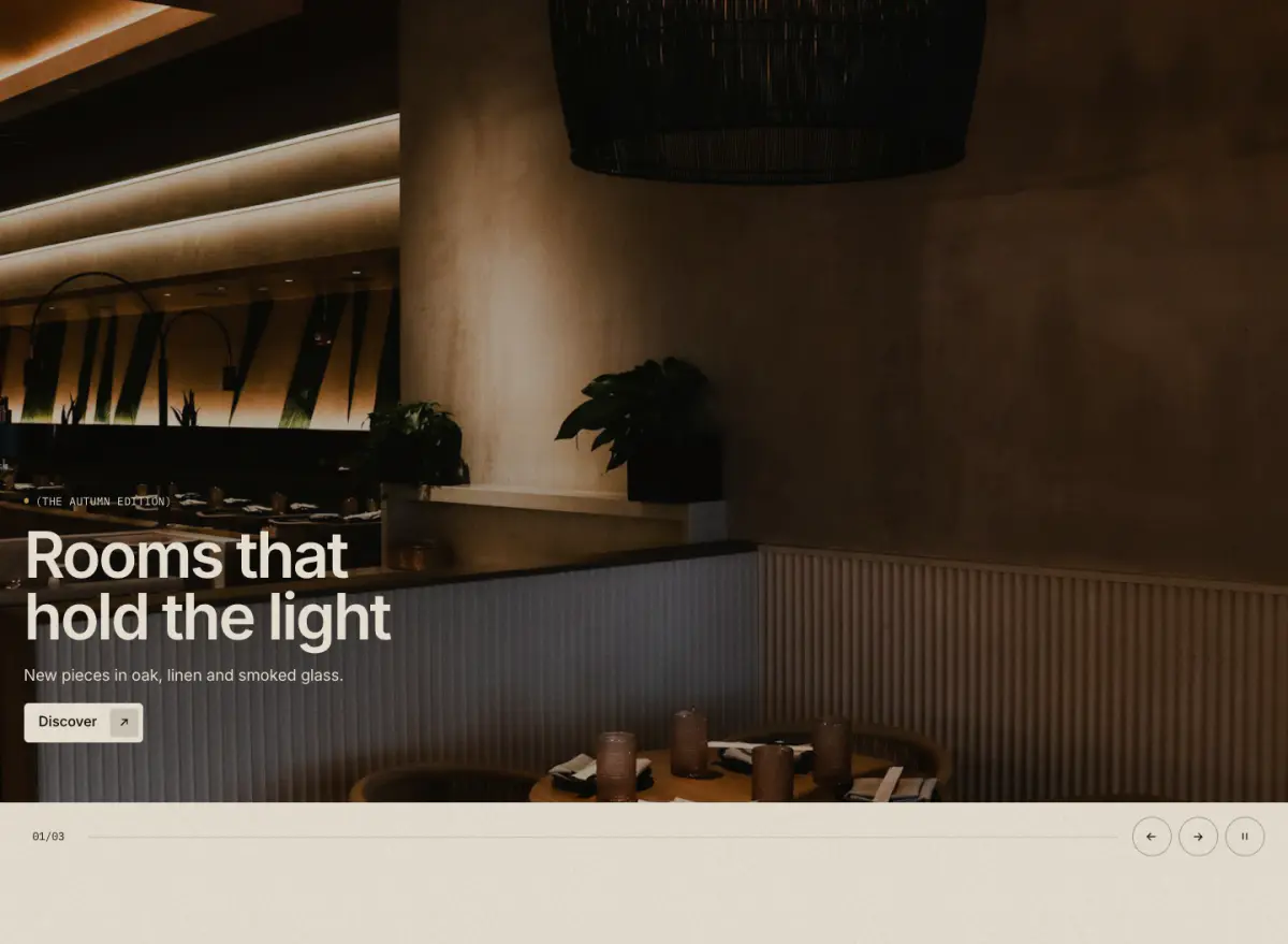
Full-width slides with a "01/03" counter, progress hairline, arrows and optional auto-rotate (paused on hover and focus, off with reduced motion and in the theme editor).
Key settings
- Slideshow name
- Heading levelH1 (page title) · H2
- Heading sizeLarge · Medium · Small · Serif display
- HeightAdapt to first image · Small · Medium · Large · Full screen
- Full width
- Stack text below image on mobile
- Auto-rotate
- Change every
Blocks (1)
- Slide
- Image, Mobile image, Image overlay, Eyebrow label, Heading, Text, Button label, Link, Button style, Content position, Show content panel