(Sections · Commerce)
Commerce and templates
Shoppable sections, plus the sections that make up the header, footer, cart, search and journal templates.
- 01Featured product
- 02Product spotlight
- 03Product story
- 04Shop the look
- 05Related products
- 06Recently viewed
- 07Header
- 08Footer
- 09Cart drawer
- 10Cart items
- 11Cart footer
- 12Search results
- 13Blog
- 14Article
- 15Compare
- 16Saved pieces
- 17Quick order list
- 18Shoppable video
Featured product
01 · featured-product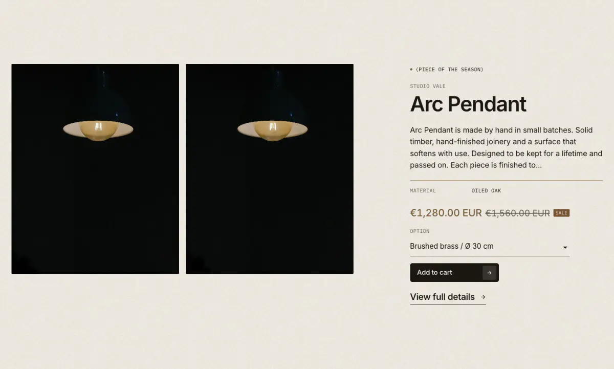
One product on any page: one image, two images or a carousel of all media, vendor, title, price, text, spec rows and a buy form or a link.
Key settings
- Product
- PurchaseBuy form (variant, quantity, add to cart) · Link to the product page only
- MediaFeatured image · First two images · All media in a carousel
- Replace the first image
- Image shapePortrait 4:5 · Portrait 3:4 · Tall 2:3 · Square · Landscape 4:3 · Landscape 3:2 · Wide 16:9 · Panorama 21:9
- Image positionLeft · Right
Blocks (7)
- Eyebrow
- Eyebrow label
- Title
- Show maker (vendor), Heading size
- Price
- No settings
- Text
- Use the product description, Description length (words), Custom text
- Spec row
- Label, Value
- Buy buttons
- Show quantity, Show dynamic checkout buttons, Product page link label
- Custom Liquid
- Custom Liquid
Product spotlight
02 · product-spotlight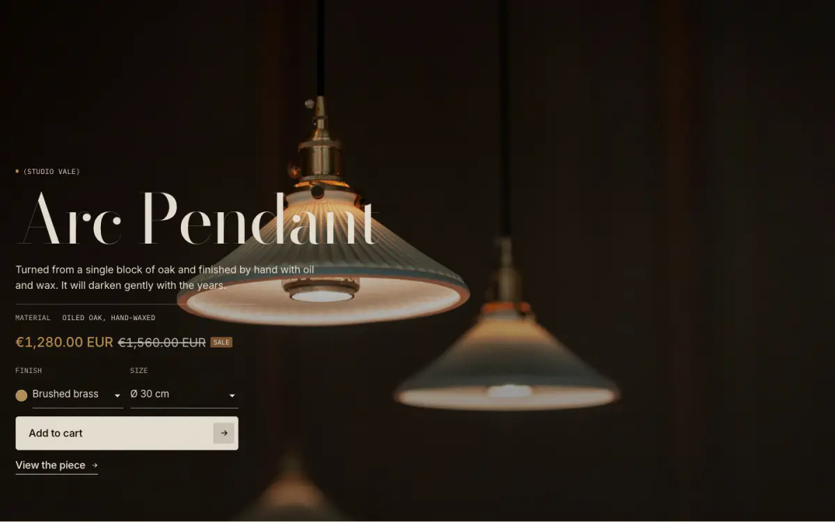
One product, full bleed: its featured photograph or video (or your own image or video) under a soft veil, with the eyebrow, title, a short text, detail lines, price and buy buttons placed in one of nine positions. Add to cart uses the real product form and opens the cart drawer; quick add opens the product in a window. Both preset home pages include it, after the editorial letter. Presets: Product spotlight, Product spotlight: video and Product spotlight: framed.
Tip: Pick the product first: until then the editor shows an example. A product video in first position plays as a silent loop when the picture is set to the product's featured media.
Key settings
- Product
- PictureProduct's featured media · Custom image · Custom video
- Image
- Shopify-hosted video
- Play video on phones
- HeightFull screen · Large · Medium
- Full width
- Content positionTop left · Top center · Top right · Middle left · Middle center · Middle right · Bottom left · Bottom center · Bottom right
- Heading levelH1 (page title) · H2
- VeilGradient toward the text · Even tint · None
- Image overlay
- Scroll effectPicture settles from a slight zoom · Words rise into place · None
Blocks (6)
- Eyebrow
- Eyebrow label, When empty, show (vendor or product type), Show bronze dot
- Heading
- Heading (empty uses the product title), Heading size, Font, Link to the product
- Text
- Text, Use the product description, Words shown
- Detail line
- Label, Value
- Price
- Show sale and sold-out badges
- Buy buttons
- Button (Add to cart · Quick add · View product), Show variant picker, Show dynamic checkout buttons, Show a link to the product, Link label
Product story
03 · product-story-split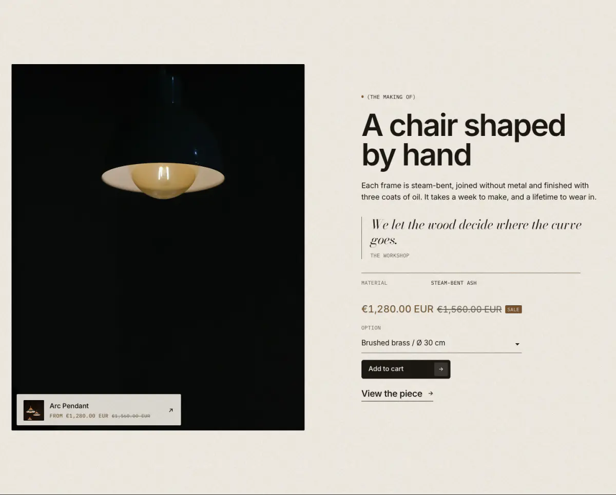
One product told as a short story: a tall lifestyle plate (sticky on desktop) beside eyebrow, heading, text, quote, spec rows and the buy form.
Key settings
- Product
- Lifestyle image
- Image shapePortrait 4:5 · Portrait 3:4 · Tall 2:3 · Square · Landscape 4:3
- Show product card on the image
- Image positionLeft · Right
Blocks (7)
- Eyebrow
- Eyebrow label
- Heading
- Heading, Heading size
- Text
- Text, Larger text
- Quote
- Quote, Author
- Spec row
- Label, Value
- Buy
- Purchase, Show quantity, Product page link label
- Custom Liquid
- Custom Liquid
Shop the look
04 · shop-the-look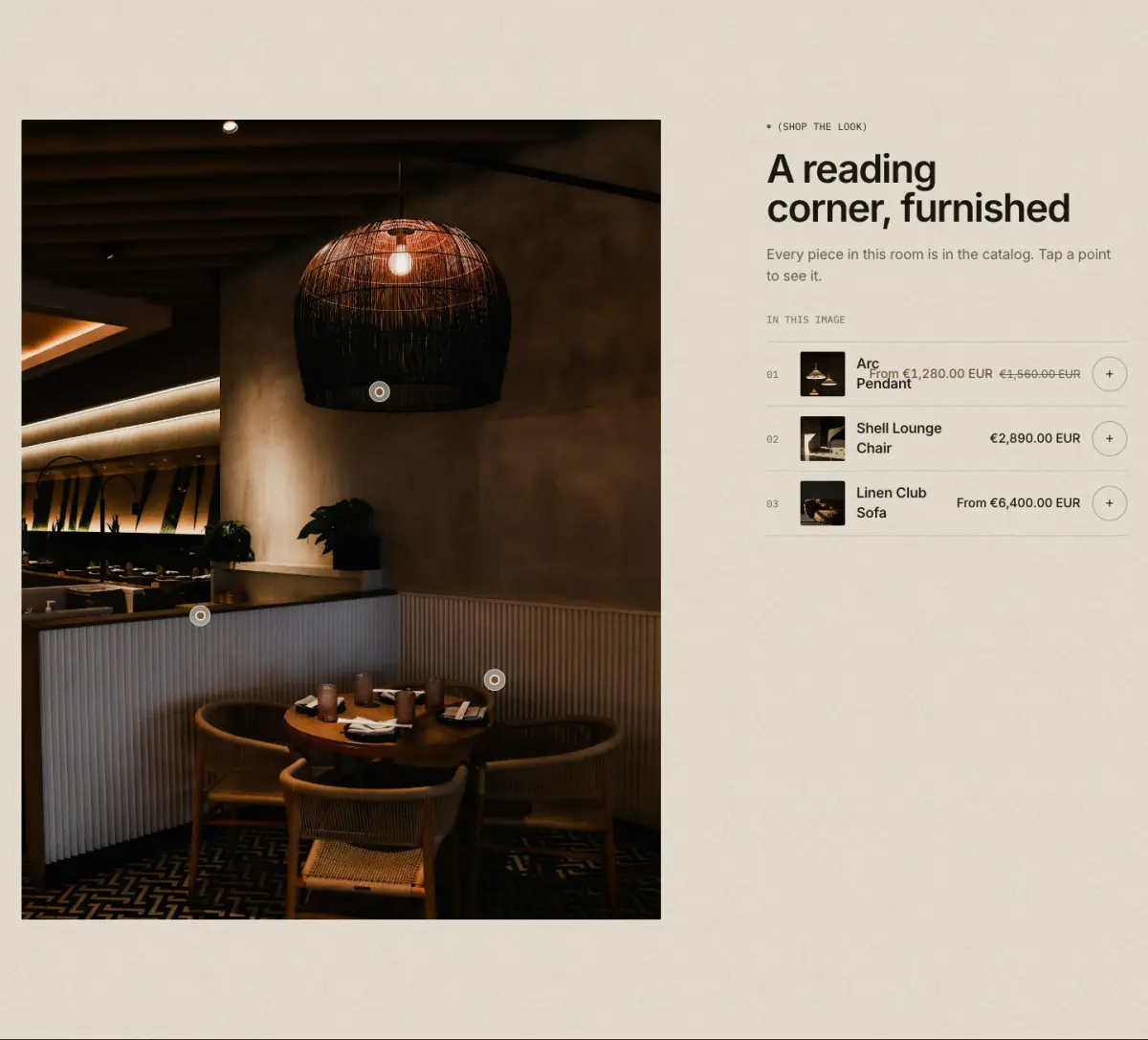
A room image with numbered hotspots; each opens a small product card with quick add, or a short note with a link. The same products are listed beside or under the image, so nothing depends on the hotspots. The Image hotspots preset starts with notes instead of products.
Tip: Keyboard: Tab to a pin, Enter or Space opens it, Escape closes it, arrow keys move between pins.
Key settings
- Product card color scheme
- Image
- Image shapeNatural · Portrait 4:5 · Square · Landscape 4:3 · Landscape 3:2 · Wide 16:9
- Eyebrow label
- Heading
- Heading sizeLarge · Medium · Small · Serif display
- Text
- Button label
- Link
- LayoutImage beside the list · Wide image, list below
- Image positionLeft · Right
- Show the product list
- Show quick add
Blocks (2)
- Product hotspot
- Product, Horizontal position, Vertical position
- Hotspot with note
- Heading, Text, Link label, Link, Horizontal position, Vertical position
Related products
05 · product-recommendations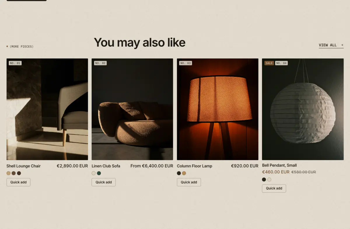
Related products loaded from Shopify's recommendations, as a grid or carousel. It hides itself when Shopify has nothing to recommend.
Key settings
- Eyebrow label
- Heading
- Maximum products
- Columns on desktop
- LayoutGrid · Carousel
- Enable quick add
Recently viewed
06 · recently-viewed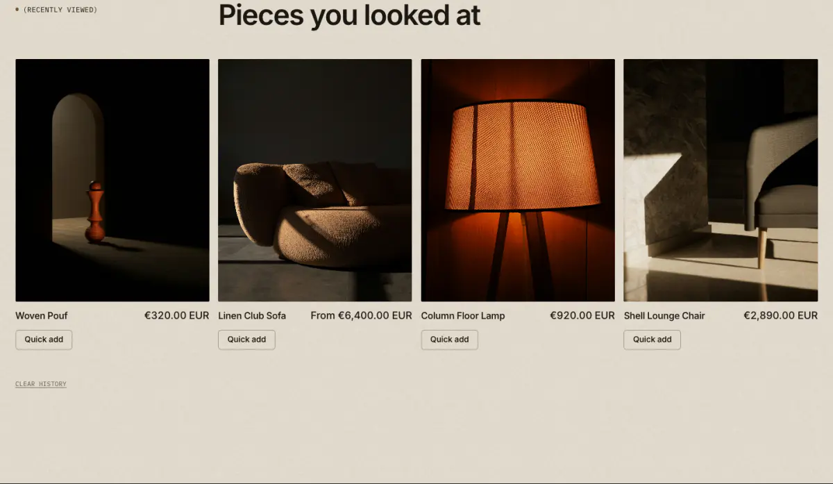
The products this visitor opened most recently, newest first, as the theme's product cards. The product on screen is left out, and the section stays hidden until there is something to show. The history is kept in the visitor's own browser. The default and story product templates include it.
Tip: In the theme editor it shows placeholder cards, so you can place and style it before any history exists.
Key settings
- Eyebrow label
- Heading
- Heading sizeLarge · Medium · Small · Serif display
- Maximum products
- Show quick add
- Show color swatches
- Show "Clear history" link
- Columns on desktop
- Top spacingNone · Small · Regular
- Bottom spacingNone · Small · Regular
Header
07 · header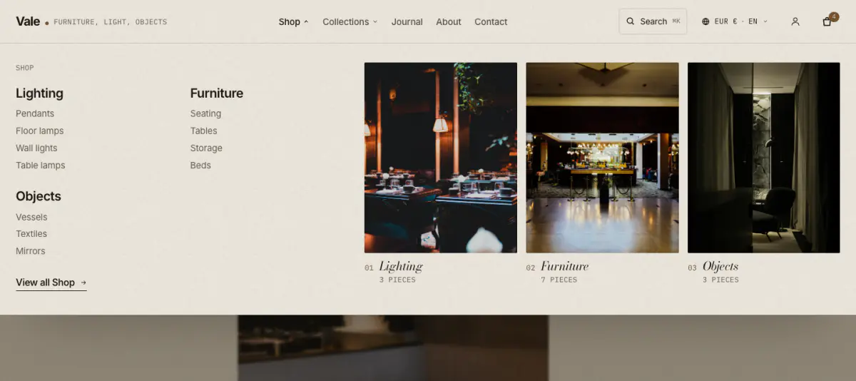
Logo with an optional mono tagline, the main menu (mega menus with pictures), search, account and cart. Sticky always, on scroll up, or off. With more than one market or language, the country/region and language selectors open as a small popover beside the icons (and at the foot of the mobile menu).
Tip: See Mega menu and search for the Mega menu block.
Key settings
- Menu
- Menu positionNext to the logo · Centered
- Other submenusFull-width panel · Small dropdown
- Sticky headerOff · Always · On scroll up
- Tagline beside the logo
- Show search
- Show account icon
- Customer account menu
- Show country/region selector
- Show language selector
- Search color scheme
- Quick links
- Collections to browse
- Mobile menu color scheme
- Closing line
Blocks (1)
- Mega menu
- Menu item, Auto-fill tiles from the submenu's collections, Pictures shown, Image, Collection, Link, Caption, Small label
Footer
08 · footer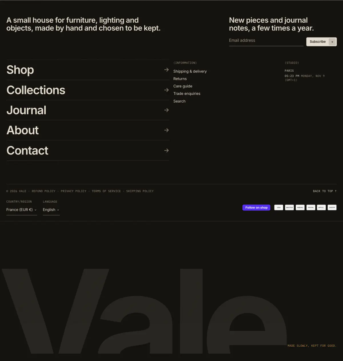
Blocks flow through a 12-column grid, each choosing its width: text, menu, email signup, local time, social links, image. Then a mono bar with copyright, policies, country and language selectors, payment icons, Follow on Shop and back to top, and the giant cropped wordmark.
Key settings
- Show giant wordmark
- Wordmark text
- Closing line
- Show country/region selector
- Show language selector
- Show payment icons
- Show policy links
- Show Follow on Shop
- Show back to top
- Show “Powered by Shopify”
Blocks (6)
- Text
- Heading, Text, Style, Width (columns of 12), Push to the right edge
- Menu
- Heading, Menu, Style, Width (columns of 12), Push to the right edge
- Email signup
- Heading, Button label, Note under the form, Width (columns of 12), Push to the right edge
- Local time
- Heading, City, Time zone, Show date, Address, Width (columns of 12), Push to the right edge
- Social links
- Heading, Style, Chat link (for example a WhatsApp
https://wa.me/link), Chat link label, Width (columns of 12), Push to the right edge - Image
- Image, Image width, Width (columns of 12), Push to the right edge
Cart drawer
09 · cart-drawer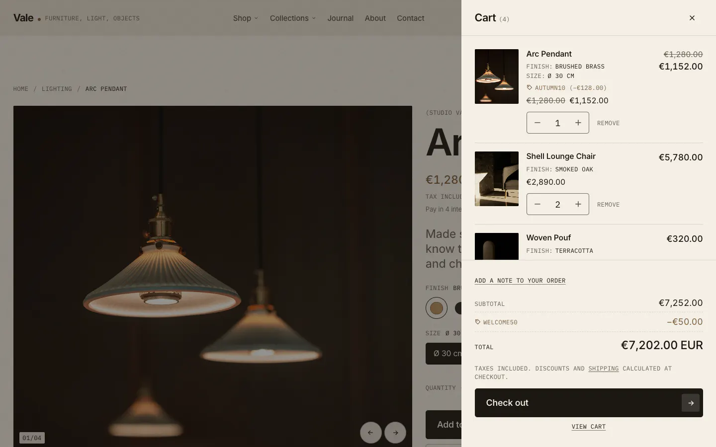
- 01Line item
- 02Quantity
- 03Order note
- 04Subtotal and taxes
- 05Checkout
The slide-out cart: line items, quantity, discounts, an optional free-shipping progress line, recommendations and dynamic checkout buttons. Choose drawer or page in Theme settings > Cart.
Key settings
- Free shipping threshold
- Show dynamic checkout buttons
- Show product recommendations
- Heading
- Recommendation typeRelated · Complementary
- Maximum products
Cart items
10 · main-cart-items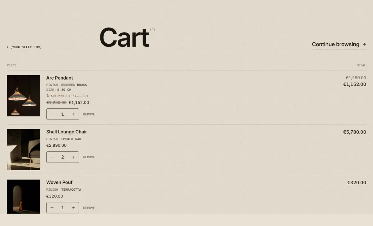
The cart page items. Works without JavaScript; with it, quantities update in place.
Key settings
- Eyebrow label
Cart footer
11 · main-cart-footer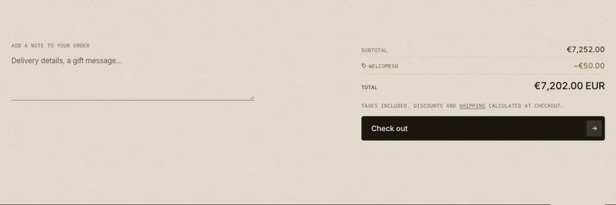
Cart note, cart-level discounts, totals, the taxes note and checkout buttons.
Key settings
- Show dynamic checkout buttons
Blocks (1)
- Custom Liquid
- Custom Liquid
Search results
12 · main-search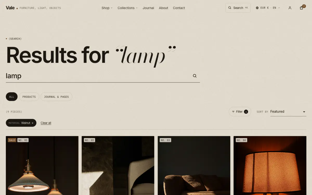
Search results with All, Products and Journal & pages tabs, the same filters, sorting and chips as collections, and pagination.
Key settings
- Eyebrow label
- Journal and pages label
- Results per page
- Columns on desktop
- Show grid density toggle
- Enable quick add
- Enable filtering
- Filter layout on desktopSidebar · Drawer
- Enable sorting
Blog
13 · main-blog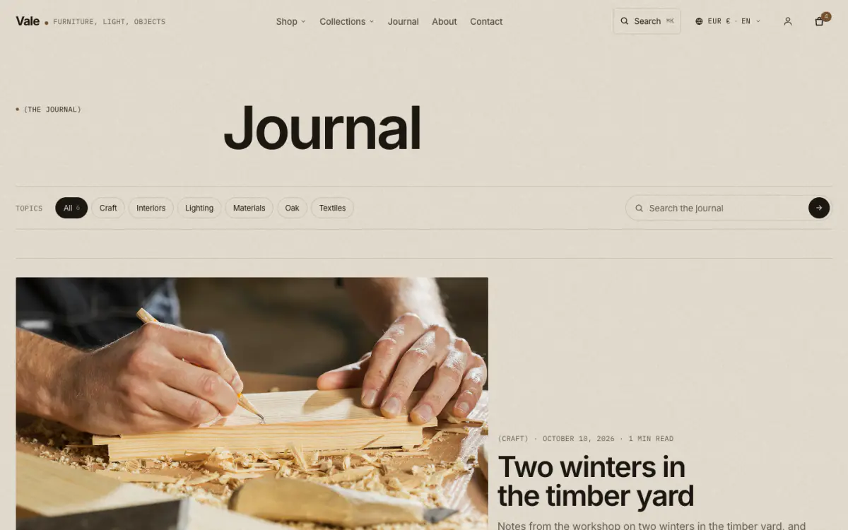
The journal index: topic filter from blog tags, journal search, the latest article large, then a grid or an index list.
Key settings
- Eyebrow label
- Introduction
- Show topic filter (blog tags)
- Show journal search
- LayoutGrid · Index list
- Feature the latest article
- Columns on desktop
- Image ratioLandscape (3:2) · Wide (16:9) · Square · Portrait (4:5)
- Articles per page
- Show image
- Show excerpt
- Show date
- Show reading time
- Show author
- Add structured data for search engines
Article
14 · main-article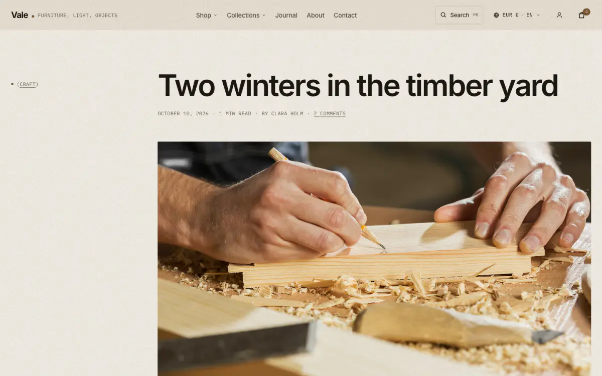
The article: every part is a block (title and details, featured image, content, pull quote, share, tags, author, comments, related articles). Content supports a drop cap, pull quotes and captions from image alt text.
Key settings
- LayoutEditorial (offset column) · Centered
- Add article structured data for search engines
Blocks (9)
- Title and details
- Show topic, Title size, Show date, Show reading time, Show author, Show comment count
- Featured image
- Width, Image ratio, Show caption
- Content
- Show excerpt as a standfirst, Drop cap on the first paragraph, Larger first paragraph, Caption images with their alt text, Text size
- Pull quote
- Quote, Attribution
- Share
- X (Twitter), Facebook, Pinterest, Email
- Tags
- No settings
- Author
- Show picture, Show bio
- Comments
- No settings
- Related articles
- Heading, Number of articles, Prefer articles with the same tags
Compare
15 · compare-products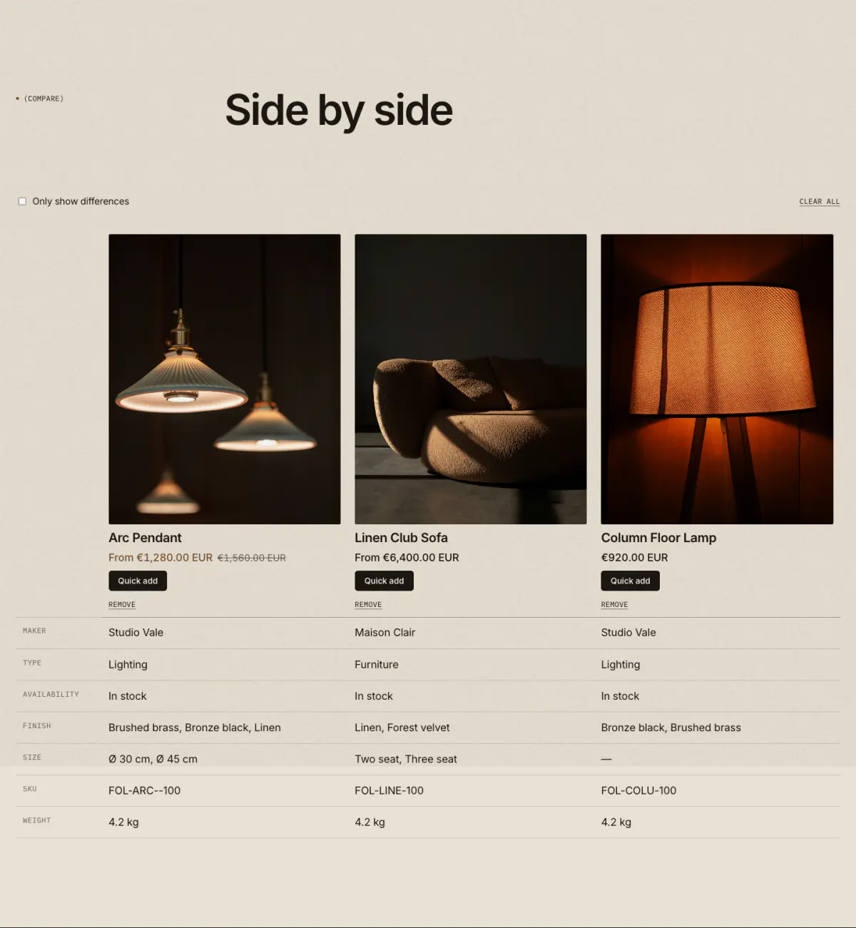
Shows the 2 to 4 pieces a shopper chose to compare, side by side: photo, price, availability and every specification metafield, with an Only show differences switch. Use it on a page with the page.compare template and pick that page in Theme settings › Product cards › Shopping tools.
Tip: Rows come from product metafields in the specs namespace (or the one you set), the same ones the product page specification table reads. See Shopping tools.
Key settings
- Eyebrow label
- Heading
- Text
- Message when empty
- Link when empty
- Color scheme
- Top spacingNone · Small · Regular
- Bottom spacingNone · Small · Regular
Saved pieces
16 · saved-products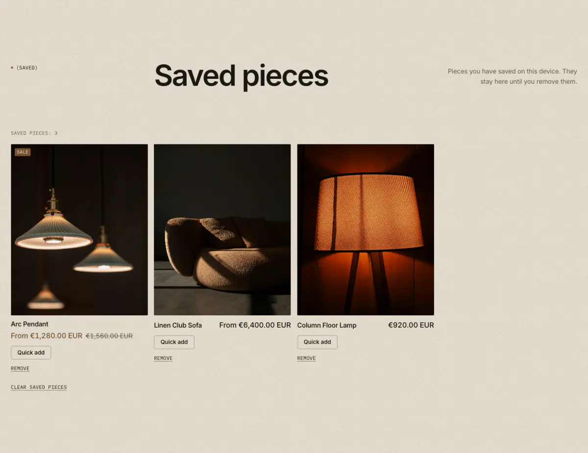
The pieces a shopper saved with the heart, kept in their browser, with Quick add, Remove and Clear. Use it on a page with the page.wishlist template and pick that page in Theme settings › Product cards › Shopping tools.
Tip: The header shows a link with the count once something is saved. See Shopping tools.
Key settings
- Eyebrow label
- Heading
- Text
- Message when empty
- Link when empty
- Columns on desktop
- Color scheme
- Top spacingNone · Small · Regular
- Bottom spacingNone · Small · Regular
Quick order list
17 · quick-order-list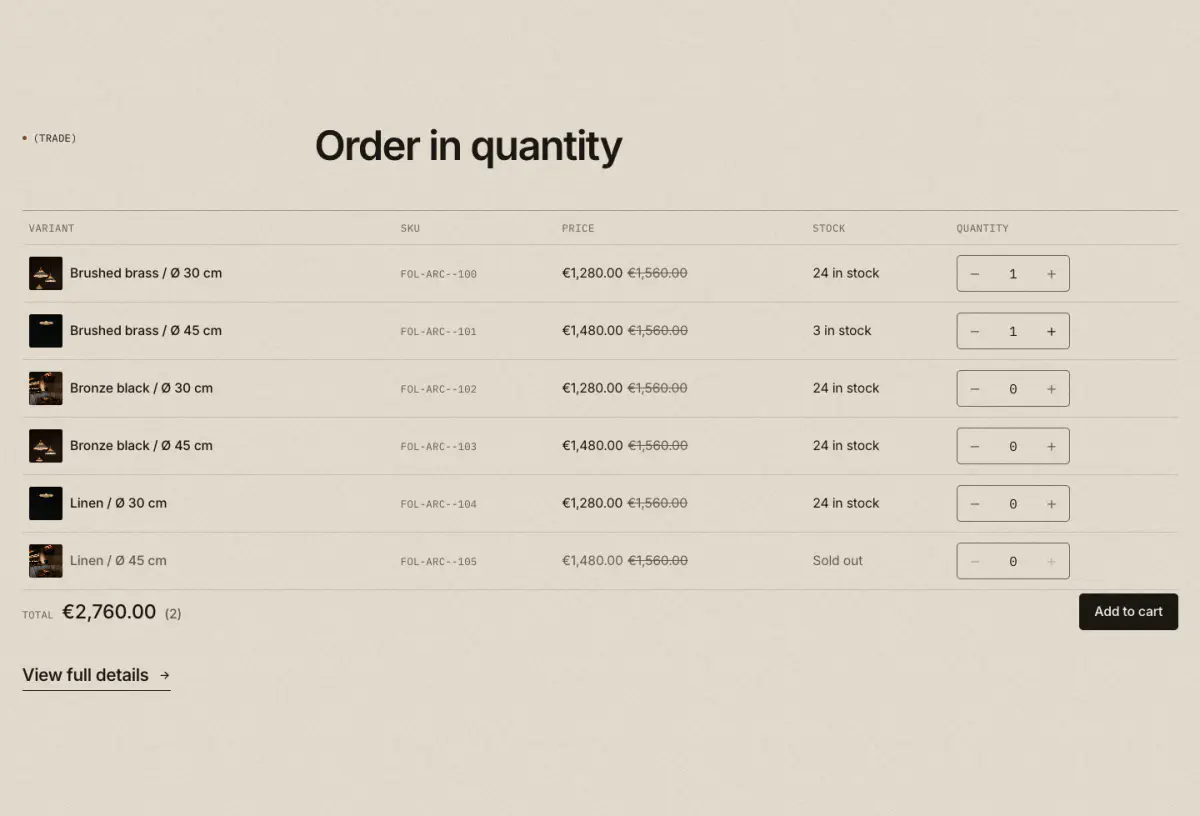
A product’s variants as an order table for trade and wholesale buyers: SKU, price with quantity breaks, stock, a quantity per row, a live total and one Add to cart for every line. The same table is available as a product page block.
Tip: Quantity rules and price breaks from B2B catalogs are applied automatically. See Shopping tools.
Key settings
- Product
- Eyebrow label
- Heading
- Text
- Rows before Show more
- Show SKU
- Show stock
- Color scheme
- Top spacingNone · Small · Regular
- Bottom spacingNone · Small · Regular
Shoppable video
18 · shoppable-video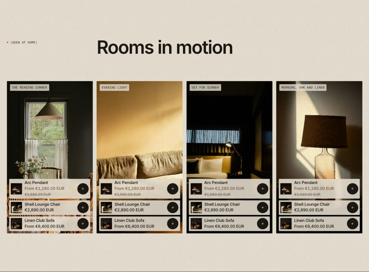
Vertical clips in a row, each tagged with up to three products that open quick add or quick view. Clips play muted only while on screen, never with reduced motion, and each has a pause control.
Tip: Upload 9:16 clips of 10 to 30 seconds in Content › Files. The screenshot shows each clip’s cover image.
Key settings
- Eyebrow label
- Heading
- Heading sizeLarge · Medium · Small · Serif display
- Text
- Clips per row on desktop
- Color scheme
- Top spacingNone · Small · Regular
- Bottom spacingNone · Small · Regular
Blocks
- Clip