(Sections · Collection)
Collection and catalog
Ways to show collections and products on any page. Product cards everywhere use the global Product cards settings (image shape, mounted style, second image on hover, catalog number).
- 01Collection tabs
- 02Collection list
- 03Shop by room
- 04Makers list
- 05Featured collection
- 06Product carousel
- 07Products with intro
- 08Collage
- 09Media collage
- 10Product collage
- 11Lookbook
Collection tabs
01 · collection-tabs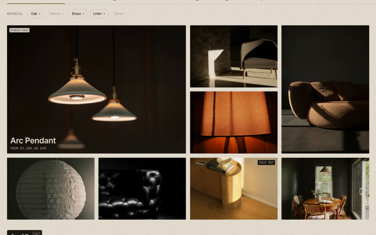
The signature store section: giant tab words with counts (one tab per collection, optionally narrowed to a tag), filter chips made from product tags, and a bento mosaic of tiles whose second image fades in on hover. Each panel ends with a "See all" link.
Tip: "Chip tags" lists the product tags that become chips, for example oak, brass, linen.
Key settings
- Eyebrow label
- Show bronze dot
- Heading
- Intro text
- Products per tab
- LayoutBento mosaic · Grid of product cards
- Grid columns on desktop
- Show vendor on tiles
- Show price on tiles
- Show quick add on product cards
- Chip tags
- Chips label
- Show "See all" button
- Second button label
- Second button link
Blocks (1)
- Tab
- Tab word, Collection, Only products tagged
Collection list
02 · collection-list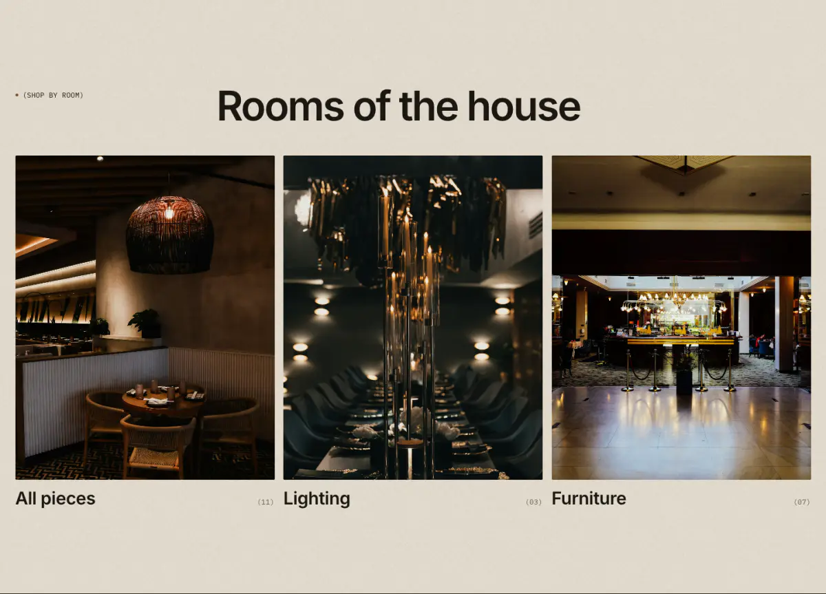
Collections as plates with title and a mono product count "(12)", in a grid or a carousel. Each collection can replace its image and title.
Key settings
- Eyebrow label
- Heading
- Heading sizeLarge · Medium · Small · Serif display
- Text
- Link label
- Link
- LayoutGrid · Carousel
- Columns on desktop
- Columns on mobile1 column · 2 columns
- Image shapePortrait 4:5 · Portrait 3:4 · Tall 2:3 · Square · Landscape 4:3 · Landscape 3:2 · Wide 16:9 · Panorama 21:9
- Title sizeLarge · Medium · Small
- Show product count (12)
- Carousel runs to the screen edge
Blocks (1)
- Collection
- Collection, Replace the image, Replace the title, Short description
Shop by room
03 · rooms-grid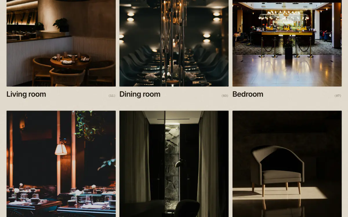
Shop by room or category: 4:5 plates that open in column order, each with a title and a count. A room can take a collection for its title, image, link and count.
Key settings
- Eyebrow label
- Show bronze dot
- Heading
- Note
- Columns on desktop
- Columns on mobileOne · Two
- Image shapePortrait 4:5 · Portrait 3:4 · Tall 2:3 · Square · Landscape 4:3 · Landscape 3:2 · Wide 16:9
- Show product count
- First button label
- First button link
Blocks (1)
- Room
- Collection, Heading, Image, Short description, Link
Makers list
04 · makers-index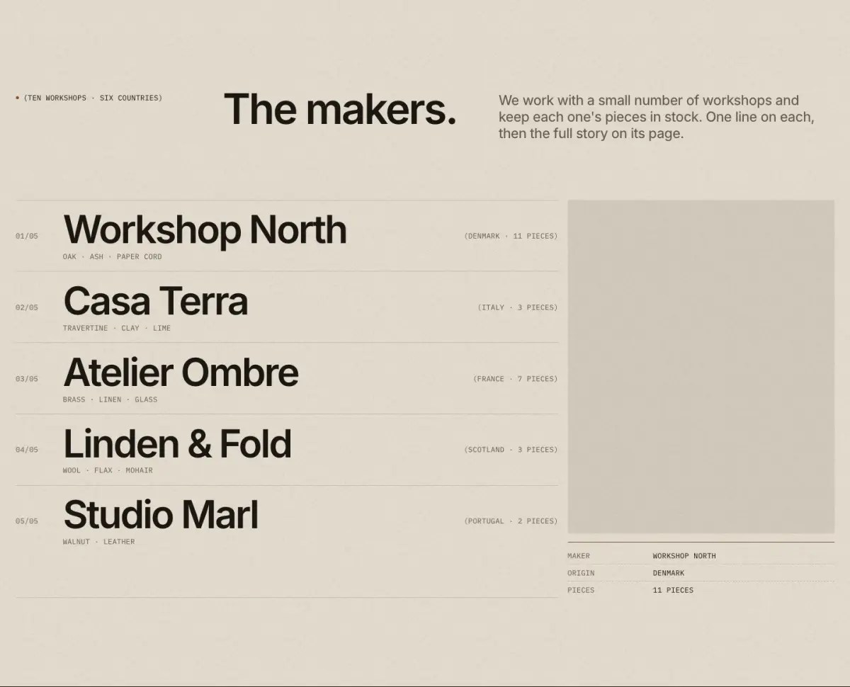
The makers or brands as big names in hairline rows (number, name, sub-label, origin, count). The hovered row stays ink while the others dim, with a sticky preview plate or an image that follows the pointer.
Tip: Link each maker to a collection (for example an automated collection where Vendor equals the maker) to show its product count.
Key settings
- Eyebrow label
- Show bronze dot
- Heading
- Note
- Image previewSticky panel beside the list · Floating image that follows the pointer · None
- Show spec label under the sticky preview
- Show product count from the collection
- Show images under each row on mobile
- Name sizeMedium · Large
Blocks (1)
- Maker
- Collection, Name, Sub-label, Origin, Image, Link
Featured collection
05 · featured-collection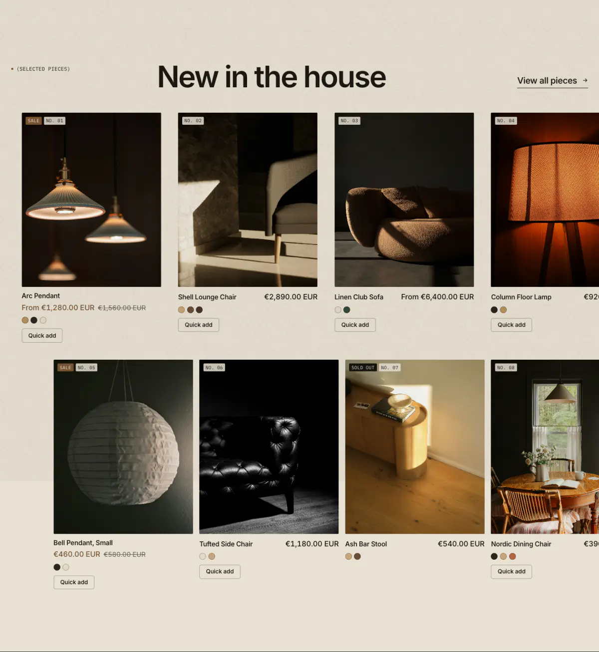
Products from one collection as a grid or a carousel, with a heading and a "View all" link.
Key settings
- Eyebrow label
- Heading
- Heading sizeLarge · Medium · Small · Serif display
- Text
- Collection
- Products to show
- Show quick add
- Show color swatches
- "View all" label
- "View all" positionIn the heading · Below the products · Hidden
- "View all" alignment below productsLeft · Center
- LayoutGrid · Carousel
- Columns on desktop
- Columns on mobile1 column · 2 columns
- Carousel runs to the screen edge
Product carousel
06 · product-carousel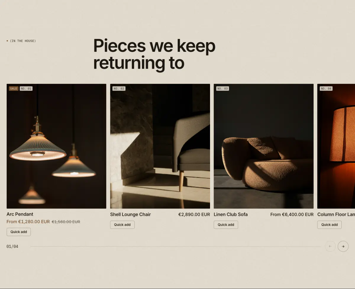
Hand-picked products, or a collection, as large plates in a carousel that bleeds off the edge, with a mono counter and progress hairline.
Key settings
- Eyebrow label
- Heading
- Heading sizeLarge · Medium · Small · Serif display
- Text
- Link label
- Link
- Products
- Or a collection
- Products to show
- Show quick add
- Show color swatches
- Columns on desktop
- Auto-rotate
- Change every
Products with intro
07 · featured-products-editorial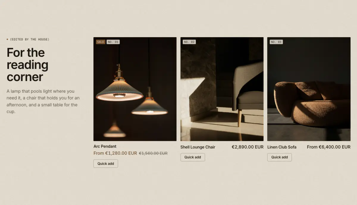
An editorial intro column (eyebrow, heading, text, link) beside a row of two to four product cards.
Key settings
- Eyebrow label
- Heading
- Heading sizeLarge · Medium · Small · Serif display
- Text
- Link label
- Link
- Products
- Or a collection
- Products in the row
- Show quick add
- Show color swatches
- Intro column positionLeft · Right
- Intro column width3 of 12 columns · 4 of 12 columns
Collage
08 · collage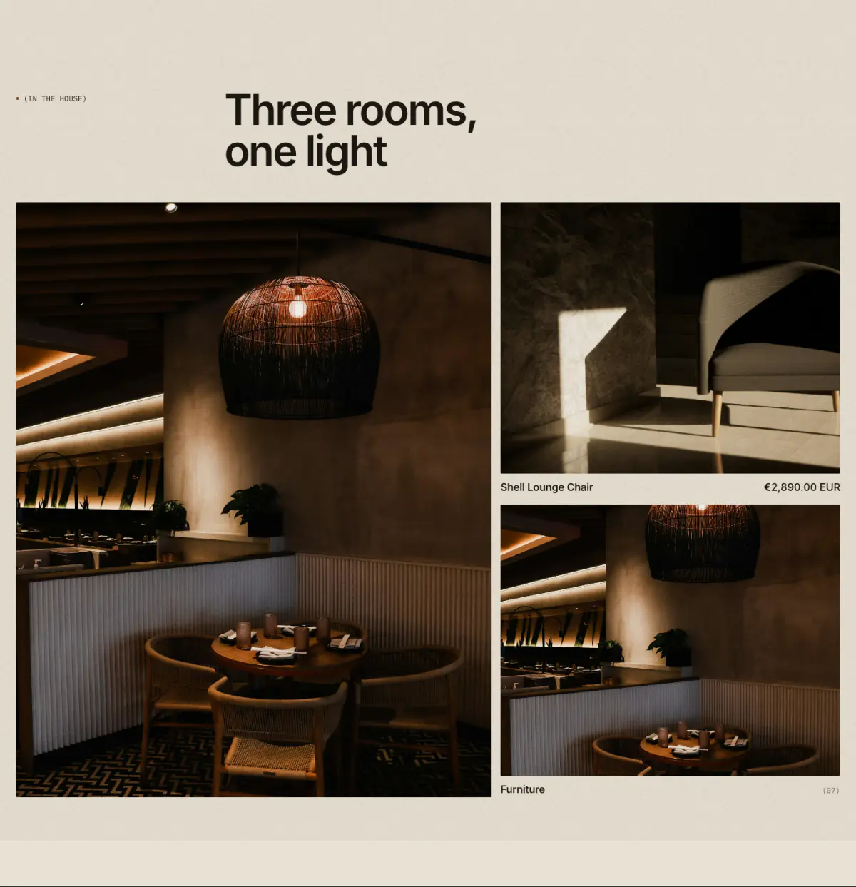
One large tile beside two smaller ones. Tiles can be an image, a product, a collection or a video.
Key settings
- Eyebrow label
- Heading
- Heading sizeLarge · Medium · Small · Serif display
- Link label
- Link
- Large tileLeft · Right
Blocks (4)
- Image
- Image, Caption, Link
- Product
- Product
- Collection
- Collection, Image override
- Video
- Shopify-hosted video, YouTube or Vimeo URL, Cover image, Video behavior, Caption
Media collage
09 · media-collage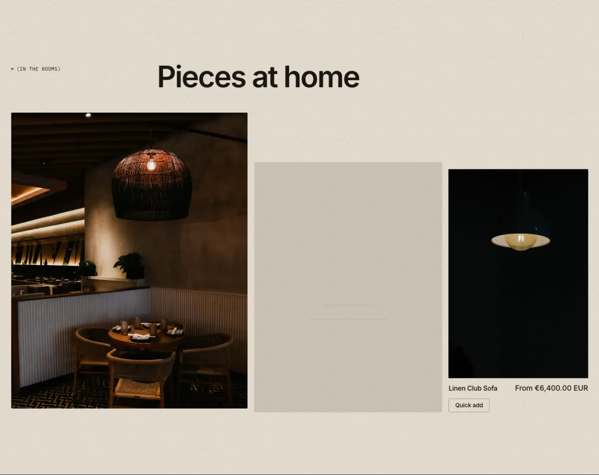
A mixed grid of images, Shopify-hosted videos and product tiles, in four layouts: asymmetric 3-up, 5-up mosaic, tall plate with two stacked, or a swipe filmstrip. Hosted videos loop muted with a poster, only while on screen, with a pause button.
Key settings
- Eyebrow label
- Heading
- Heading sizeLarge · Medium · Small · Serif display
- Text
- Link label
- Link
- LayoutAsymmetric, 3 plates · Mosaic, 5 plates · Tall plate and two stacked · Filmstrip (swipe row)
- Filmstrip plates per view on desktop
- Filmstrip plate shapePortrait 4:5 · Portrait 3:4 · Tall 2:3 · Square · Landscape 4:3
- Caption styleBelow the plate · Label on the plate
- Show numbers (01)
- Show quick add
Blocks (3)
- Image
- Image, Caption, Link
- Video
- Shopify-hosted video, Cover image, Video behavior, Caption, Link
- Product
- Product, Image override, Caption
Product collage
10 · product-collage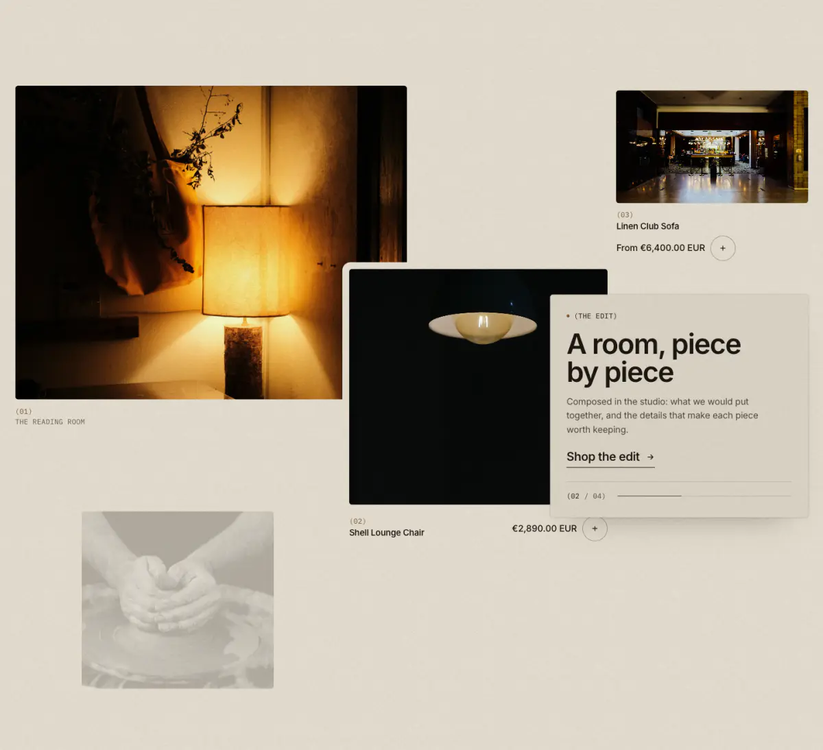
Products and photographs composed like a magazine spread. Five layouts: editorial overlapping plates, bento, moodboard (a studio wall of 9 to 14 prints), lookbook with hotspots, and a parallax stack.
Tip: Product blocks have hotspot position settings used by the lookbook layout.
Key settings
- LayoutEditorial: overlapping plates · Bento: hero and details · Moodboard: scattered prints · Lookbook with hotspots · Parallax stack
- Eyebrow label
- Heading
- Heading sizeMedium · Small · Serif display
- Text
- Link label
- Link
- Show quick add
- Show numbers (01)
- Full width
- Image
- Animate on scroll
- Intensity
Blocks (2)
- Product
- Product, Image override, Caption, Hotspot horizontal position, Hotspot vertical position
- Image
- Image, Caption, Link
Lookbook
11 · lookbook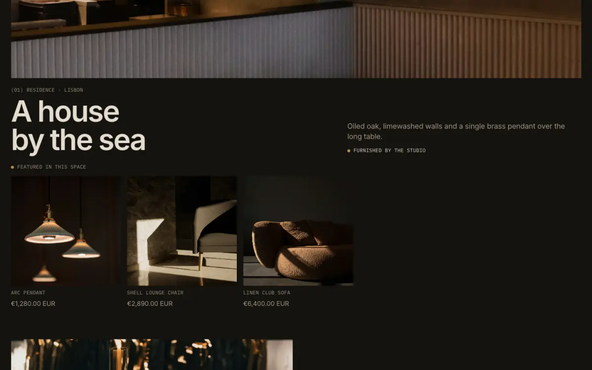
Interiors or projects. The first look is a wide lead with a "Featured in this space" row of products; the others fall into a staggered two-column grid. Each look can list up to four products.
Key settings
- Eyebrow label
- Show bronze dot
- Heading
- Intro text
- Meta line
- Products label
- Show the first look as a wide lead
- Stagger the two-column grid
- Show product prices
- First button label
- First button link
Blocks (1)
- Look
- Image, Heading, Type and place, Summary, Credit line, Link, Products in this space