(Guides · Collections)
Collections and filters
One Product grid section, four ways to look at it. Pick a default per template, and let shoppers switch if you like.
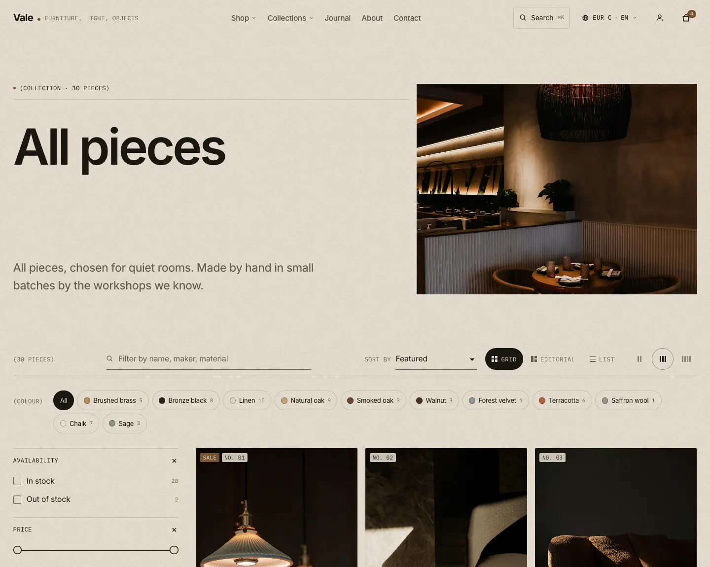
- 01Collection banner
- 02Banner image
- 03Quick links (chips)
- 04Filters and sort bar
- 05Sort
- 06Grid density
- 07Product card
The four layouts
- Grid
- Even product cards, with a 2/3/4 density toggle
- Editorial
- A magazine spread: every Nth piece (setting, default 7) is set large with its lifestyle image, alternating sides. Up to four Editorial tile blocks (image, headline, link) sit at a chosen position
- List / catalog
- A trade catalog or price list: thumbnail, title and maker, materials, mono details, price and quick add. A larger image follows the cursor on hover
- Gallery
- Large plates in one or two columns with minimal captions
The editorial layout uses each product's last image as its lifestyle image. Put a room shot last in the product's media to get the effect, or set Editorial: large piece image to Featured image.
Collection templates
| Template | Banner | Product display |
|---|---|---|
collection (default) | Side plate, sans title | Grid |
collection.editorial | Full-bleed cover, serif title | Editorial, with a tile |
collection.catalogue | Text only | List / catalog |
collection.gallery | Centered, serif title | Gallery |
Assign a template in Products > Collections > (collection) > Theme template.
Materials in the catalog view
The list view shows each product's materials from the custom.material metafield, or from tags with the material: prefix (for example material:Walnut). Both are settings: Materials metafield and Materials tag prefix.
Filtering and sorting
Vale supports Shopify's storefront filtering on collections and search: list, color swatch, image, price range (with a two-handle slider) and boolean filters, plus sorting and removable active-filter chips. Choose which filters appear in the free Search & Discovery app by Shopify.
- Enable filtering
- Hidden automatically when the collection has no filters
- Filter layout on desktop
- Sidebar or drawer. On phones it is always a drawer with an Apply button
- Filter groups open by default
- How many groups start expanded
- Values shown before "Show more"
- Long lists collapse
- Search box in filters
- Appears for filters with at least the number of values you set
- Enable sorting
- Featured, best selling, price, date and alphabetical
Chips above the grid
Chips above the grid shows quick filters: the values of one filter (set Filter name, for example Color) or a list of tags (Tags, comma-separated, for example oak, brass, new). Tag pages can't be combined with storefront filters, so pick one approach per collection.
"Filter these pieces"
A small text field above the grid narrows the products on the current page by name, maker, type and tags as you type, and offers a store search with the same filters for anything not on the page.
Pagination
Numbered pages or a Load more button; choose with Pagination. Both keep the URL shareable and work without JavaScript.